【Matplotlib】折れ線グラフや散布図!線種,線色,マーカー (plot)
\ 迷ったらまずTechAcademyの無料カウンセリング! /
Pythonでデータを可視化するためにグラフを描画したいと思ったことはありませんか?
PythonにはMatplotlibというグラフを作るための優れたライブラリがあります
Matplotlibは,簡単なものは簡単に,難しいものも可能にします
Matplotlib
本記事では,最も一般的なAxes.plot関数を使った折れ線グラフや散布図の表示方法を解説します
また,色や線の種類,太さなどのカスタマイズ方法についても解説しています
初めてMatplotlibを使用するかたは下記記事を参考にしてください
折れ線グラフ (Axes.plot)
Matplotlibで最も基本的なグラフを表示するには,Axes.plot関数を用います
Axes.plotに,yのみを入力すると等間隔にyの値がグラフ上に表示されますが,xとyの両方を入力するとx対yのグラフになります
- 引数
-
- x, y (配列 or 値) : データの座標.yのみの指定であれば,xには[0~yの数]の配列が指定されます
- label (配列) : ラベル
- fmt (文字列) : フォーマット文字列.線種,線色,マーカーを一度に指定可能
- linestyle (文字列) : 線のスタイル.[– (solid), — (dashed), -. (dashdot), : (dotted), (None)]から指定可能
- linewidth (float) : 線の太さ
- alpha (float) : 透明度.0~1の範囲内
- marker (文字列) : マーカーの種類.matplotlib.markers
- markerfacecolor (color) : マーカーのメインの色
- markeredgecolor (color) : マーカーの枠の色
- markeredgewidth (float) : マーカーの枠の太さ
- fillstyle (文字列) : マーカーの塗りつぶす領域.full, left, right, bottom, top, none
- 返値
-
- Line2Dのリスト
- 公式ドキュメント
下記のタブにコードとフローチャートの解説をしています
# step0 ライブラリの読み込み
import matplotlib.pyplot as plt
import numpy as np

# step1 データの作成
x = np.linspace(0, 10, 100)
y1 = 4 + 2 * np.sin(2 * x)
y2 = 4 + 2 * np.cos(2 * x)

# step2 グラフフレームの作成
fig, ax = plt.subplots()

# step3 グラフの描画
ax.plot(x, y1, linestyle='-', label='Sample 1')
ax.plot(x, y2, linestyle='--', label='Sample 2')

# step4 軸,凡例,タイトルの設定
ax.set_xlim(0, 8)
ax.set_ylim(0, 8)
ax.set_xlabel('X label')
ax.set_ylabel('Y label')
ax.legend()
ax.set_title('Simple line')

# step5 Figureの呼び出し
plt.show()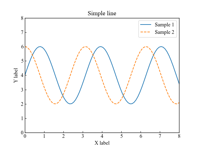
散布図 (fmt)
Axes.plot関数で散布図を表示するには,線のスタイルは指定せず,マーカーのみ指定します
その際に便利なのが,fmt(フォーマット文字列)でマーカー,線色,線種を一度に指定します
or--: o=サークル,r=赤,--=破線
# step3 グラフの描画
ax.plot(x, y1, 'o',label='Sample 1')
ax.plot(x, y2, 'or--', label='Sample 2')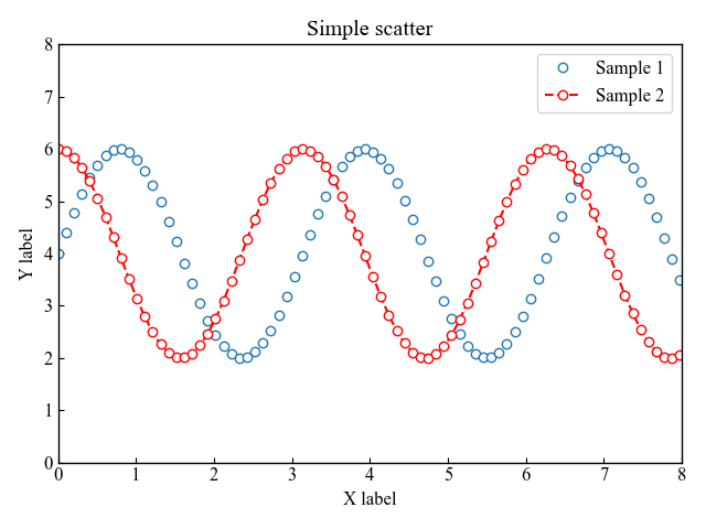
折れ線グラフの線スタイルと透明度
線色や線種,線の太さなどの線のカスタマイズは,color, linestyle, linewidthを使います
また,alphaを0~1の範囲内で数値を入力すると,透明度が変わります
線の色 (color)
線色は引数にcolorを入力します
color='red': 赤色
color='00BCD4': カラーコード
# step3 グラフの描画
ax.plot(x, y1, label='red', color='red')
ax.plot(x, y2, label='#00BCD4', color='#00BCD4')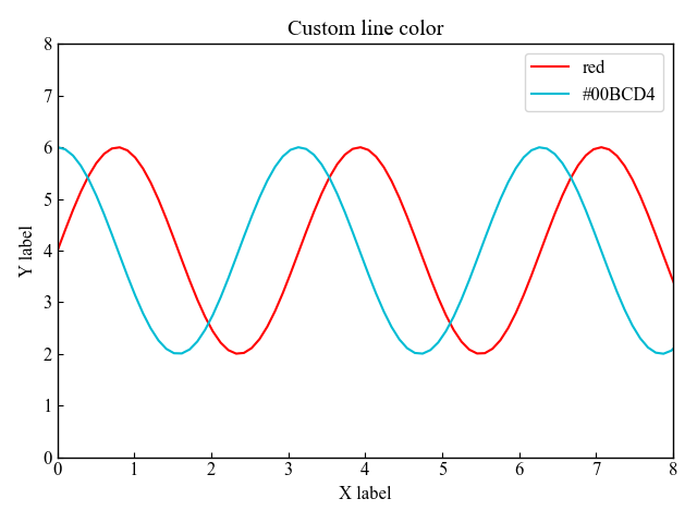
線の種類 (linestyle)
線の種類はlinestyleを使います
linestyle='-': ソリッドlinestyle='--': 破線linestyle='-.': 一点鎖線linestyle=':': ドットlinestyle='': 線無し
# step3 グラフの描画
ax.plot(x, y1, label='dashed', linestyle='-.')
ax.plot(x, y2, label='dotted', linestyle=':')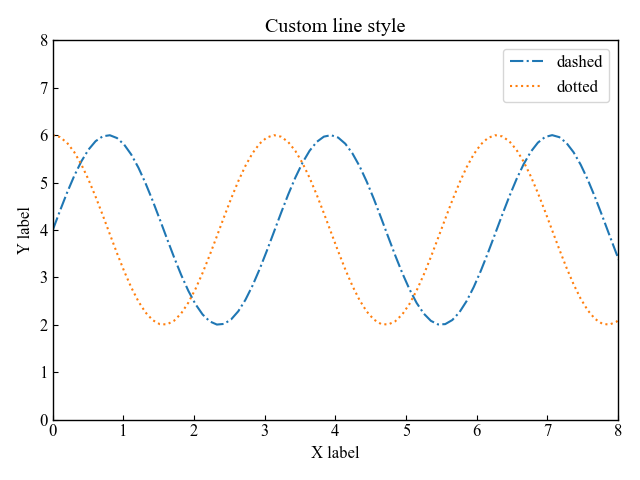
線の太さと透明度 (linewidth, alpha)
線の太さは,linewidthに数値を入力します
linewidth=5: 太さ5
線の透明度は,alpha=0.5と0~1の間の数値を入力します
# step3 グラフの描画
ax.plot(x, y1, label='linewidth=5', linewidth=5)
ax.plot(x, y2, label='lw=5, alpha=0.5', linewidth=5, alpha=0.5)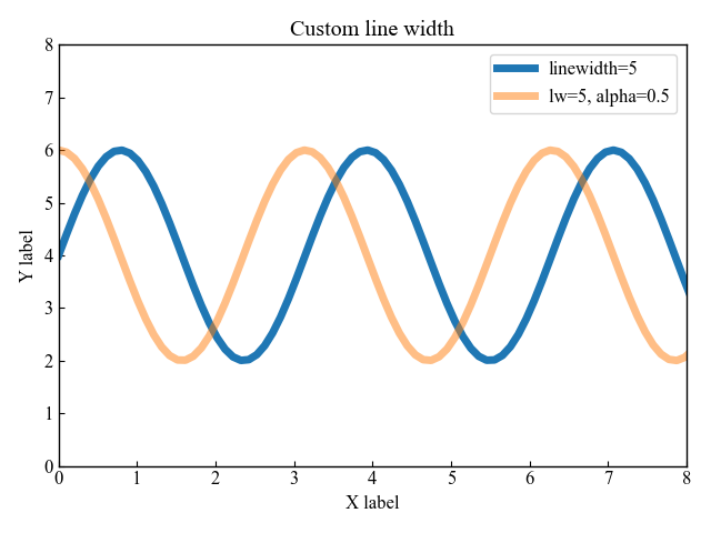
折れ線グラフのマーカー (marker)
マーカーの種類は,matplotlib.markersに記載されている文字列を入力して選ぶことができます
fmtでマーカーのみを指定: 線なし=散布図
markerでマーカーを指定: 線あり=折れ線グラフ
markerでマーカー指定
マーカーは,丸,四角,三角としました
# step3 グラフの描画
ax.plot(x, y1, marker='o', label='marker=o')
ax.plot(x, y2, marker='s', label='marker=s')
ax.plot(x, y2-2, marker='^', label='marker=^')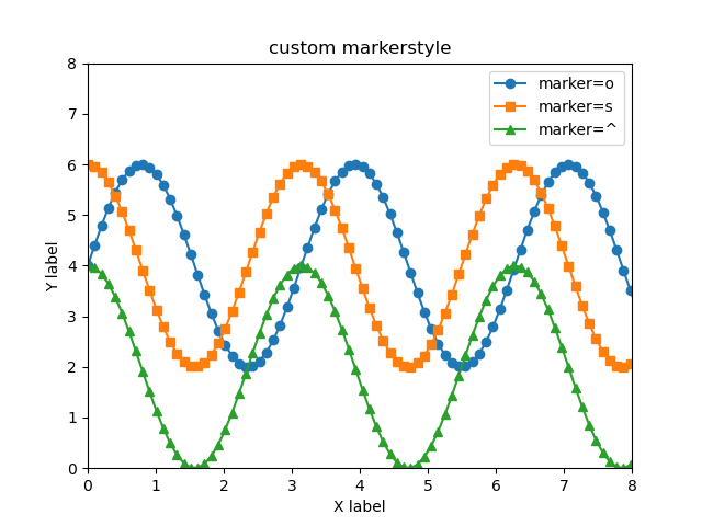
fmtでマーカーのみを指定
fmt(フォーマット文字列)はマーカー,線色,線種を一度に指定します
詳細は散布図に記載しています
# step3 グラフの描画
ax.plot(x, y1, 'o', label='fmt=o')
ax.plot(x, y2, 's', label='fmt=s')
ax.plot(x, y2-2, '^', label='fmt=^')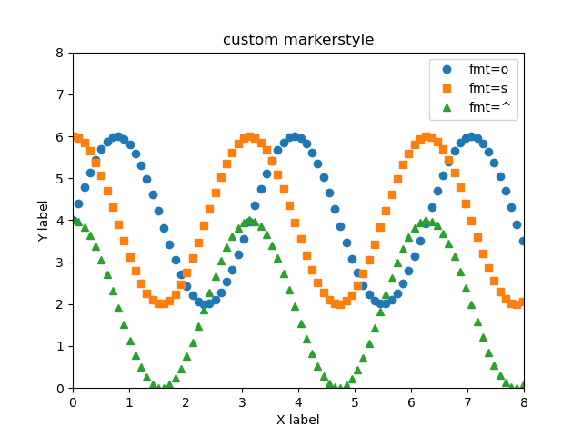
折れ線グラフのマーカーの色
マーカーの色は,表面と枠の2つに分かれます
また,塗りつぶす領域を指定できます
マーカーの表面の色 (markerfacecolor)
マーカー表面の色は白と黒としました
markerfacecolor='white': 白色の表面
# step3 グラフの描画
ax.plot(x, y1, marker='o', label='face=white', markerfacecolor='white')
ax.plot(x, y2, marker='s', label='face=black', markerfacecolor='black')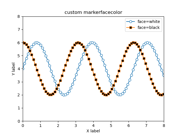
マーカーの枠の色と太さ (markeredgecolor, markeredgewidth)
マーカーの枠は色と太さの変更ができます
markeredgecolor='red': 赤色の枠markeredgewidth=3: 太さ3の枠
# step3 グラフの描画
ax.plot(x, y1, marker='o', label='edgecolor=red',
        markeredgecolor='red')
ax.plot(x, y2, marker='s', label='edgewidth=3',
        markeredgecolor='red', markeredgewidth=3)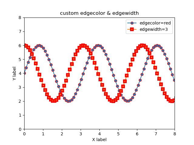
マーカーの塗りつぶしエリア (fillstyle)
マーカーの塗りつぶす領域はfillstyleで決定します
指定可能な領域はfull, left, right, bottom, top, noneとなります
# step3 グラフの描画
ax.plot(x, y1, marker='o', label='fill=top', fillstyle='top')
ax.plot(x, y2, marker='s', label='fill=bottom', fillstyle='bottom')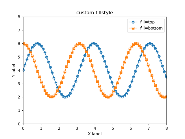
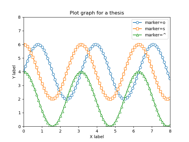
論文用のきれいなフォーマット
マーカーの種類+表面の色の2つを組み合わせると綺麗なグラフになります
markerfacecolor='white': 白色の表面marker='o': 丸, marker='s': 四角, marker='^': 三角
# step1 データの作成
x = np.linspace(0, 10, 100)
y1 = 4 + 2 * np.sin(2 * x)
y2 = 4 + 2 * np.cos(2 * x)
# step2 グラフフレームの作成
fig, ax = plt.subplots()

# step3 グラフの描画
ax.plot(x, y1, marker='o', label='marker=o', markerfacecolor='white')
ax.plot(x, y2, marker='s', label='marker=s', markerfacecolor='white')
ax.plot(x, y2-2, marker='^', label='marker=^', markerfacecolor='white')

# step4 軸,凡例,タイトルの設定
ax.set_xlim(0, 8)
ax.set_ylim(0, 8)
ax.set_xlabel('X label')
ax.set_ylabel('Y label')
ax.legend()
ax.set_title('Plot graph for a thesis')

# step5 Figureの呼び出し
plt.show()参考文献
Axes.plot関数
lines.Line2Dクラス