PythonのMatplotlibは少ないコードでグラフを表示することができます
しかし,プログラミングであるため,ExcelやTableauのようにクリックするだけで軸関連の設定はできません
本記事では,グラフの設定をまとめて,一覧することができるようにしました
あの設定はどう書くんだっけといった悩みを解決します
設定なしのデフォルトの折れ線グラフ
Matplotlibで設定を何もしていない折れ線グラフを作成しました
折れ線グラフはAxes.plot関数で描画することができます
下記のタブにplt_defaultとフローチャートの解説をしています
import matplotlib.pyplot as plt
import numpy as np


def plt_default():
    x = np.linspace(0, 10, 100)
    y1 = 4 + 2 * np.sin(2 * x)
    y2 = 4 + 2 * np.cos(2 * x)

    fig, ax = plt.subplots()

    ax.plot(x, y1, 'o--', label='Sample 1')
    ax.plot(x, y2, 'D--', label='Sample 2')

    plt.show()

if __name__ == '__main__':
    plt_default()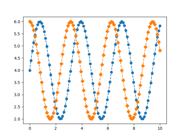
グラフのタイトル (Axes.set_title, Figure.suptitle)
グラフのタイトルは,FigureとAxesのそれぞれに設定することができます
- 引数
-
- label (文字列) : タイトルのテキストは文字列で指定します
- fontdict (辞書) : タイトルのテキストは辞書型でまとめて設定できます
- loc (center, left, right) : 位置を中央,左右で選べます
- pad (float) : Axesの上端からの距離を数値で指定できます.(default=6.0)
- y (float) : タイトルの縦軸の位置 (1.0が一番上)
- 返値
- 公式ドキュメント
- 引数
-
- t (文字列) : suptitleの文字列です
- x (float) : テキストの x 位置をグラフ座標で指定します
- y (float) : テキストの y 位置をグラフ座標で指定します
- ha (center, left, right) : (x, y)を基準としたテキストの水平方向の配置を指定します
- va (top, center, bottom, baseline) : (x, y)を基準としたテキストの垂直方向の配置を指定します
- size (文字列 or float) : フォントサイズをfloatもしくは次の文字列で指定できます.
‘xx-small’, ‘x-small’, ‘small’, ‘medium’, ‘large’, ‘x-large’, ‘xx-large’ - weight (文字列) : フォントの太さは0-1000の範囲の数値もしくは次の文字列で指定できます.
‘ultralight’, ‘light’, ‘normal’, ‘regular’, ‘book’, ‘medium’, ‘roman’, ‘semibold’, ‘demibold’, ‘demi’, ‘bold’, ‘heavy’, ‘extra bold’, ‘black’
- 返値
- 公式ドキュメント
下記のタブにplt_titleとフローチャートの解説をしています
import matplotlib.pyplot as plt
import numpy as np


def plt_title():
    x = np.linspace(0, 10, 100)
    y1 = 4 + 2 * np.sin(2 * x)
    y2 = 4 + 2 * np.cos(2 * x)

    fig, ax = plt.subplots()

    ax.plot(x, y1, 'o--', label='Sample 1')
    ax.plot(x, y2, 'D--', label='Sample 2')

    ax.set_title('Ax Title')
    fig.suptitle('Fig Title')

    plt.show()

if __name__ == '__main__':
    plt_title()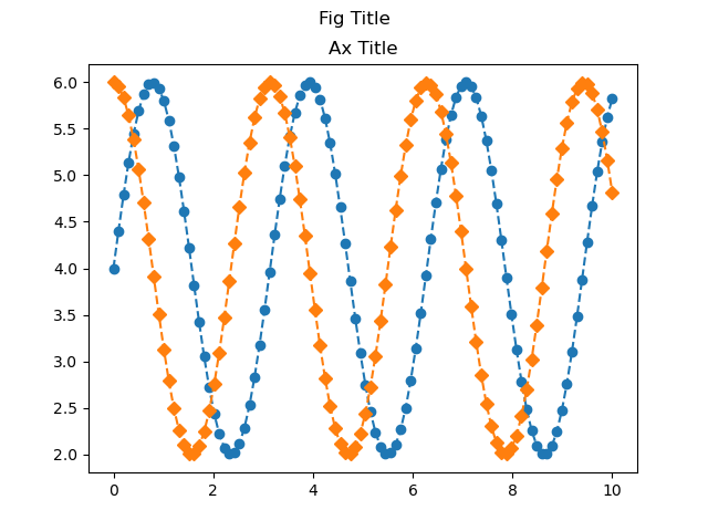
軸ラベル (set_xlabel, set_ylabel, supxlabel, supylabel)
グラフの軸ラベルは,FigureとAxesのそれぞれに設定することができます
そのまま2つとも表示させるとラベル同士が重なるため,1つずつ紹介します
Axesの軸ラベル (Axes.set_xlabel, Axes.set_ylabel)
Axesへの軸ラベル設定は,Axes.set_xlabelとAxes.set_ylabelを使います
- 引数
-
- xlabel, ylabel (文字列) : ラベルのテキストを文字列で指定します
- labelpad (float) : 目盛りと目盛りラベルを含む,軸からの間隔
- loc (center, left, right) : 位置を中央,左右で選べます
- 返値
- 公式ドキュメント
下記のタブにplt_labelとフローチャートの解説をしています
import matplotlib.pyplot as plt
import numpy as np


def plt_label():
    x = np.linspace(0, 10, 100)
    y1 = 4 + 2 * np.sin(2 * x)
    y2 = 4 + 2 * np.cos(2 * x)

    fig, ax = plt.subplots()

    ax.plot(x, y1, 'o--', label='Sample 1')
    ax.plot(x, y2, 'D--', label='Sample 2')

    ax.set_title('Ax Title')
    fig.suptitle('Fig Title')

    ax.set_xlabel('X Label')
    ax.set_ylabel('Y Label')
    # fig.supxlabel('Sup X Label')
    # fig.supylabel('Sup Y Label')

    plt.show()


if __name__ == '__main__':
    plt_label()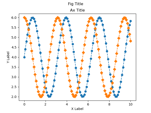
Figureの軸ラベル (Figure.supxlabel, Figure.supylabel)
Figureへの軸ラベル設定は,Figure.supxlabelとFigure.supylabelを使います
suptitleと使い方は同じです
- 引数
-
- t (文字列) : suptitleの文字列です
- x (float) : テキストの x 位置をグラフ座標で指定します
- y (float) : テキストの y 位置をグラフ座標で指定します
- ha (center, left, right) : (x, y)を基準としたテキストの水平方向の配置を指定します
- va (top, center, bottom, baseline) : (x, y)を基準としたテキストの垂直方向の配置を指定します
- size (文字列 or float) : フォントサイズをfloatもしくは次の文字列で指定できます.
‘xx-small’, ‘x-small’, ‘small’, ‘medium’, ‘large’, ‘x-large’, ‘xx-large’ - weight (文字列) : フォントの太さは0-1000の範囲の数値もしくは次の文字列で指定できます.
‘ultralight’, ‘light’, ‘normal’, ‘regular’, ‘book’, ‘medium’, ‘roman’, ‘semibold’, ‘demibold’, ‘demi’, ‘bold’, ‘heavy’, ‘extra bold’, ‘black’
- 返値
- 公式ドキュメント
下記のタブにplt_labelとフローチャートの解説をしています
import matplotlib.pyplot as plt
import numpy as np


def plt_label():
    x = np.linspace(0, 10, 100)
    y1 = 4 + 2 * np.sin(2 * x)
    y2 = 4 + 2 * np.cos(2 * x)

    fig, ax = plt.subplots()

    ax.plot(x, y1, 'o--', label='Sample 1')
    ax.plot(x, y2, 'D--', label='Sample 2')

    ax.set_title('Ax Title')
    fig.suptitle('Fig Title')

    # ax.set_xlabel('X Label')
    # ax.set_ylabel('Y Label')
    fig.supxlabel('Sup X Label')
    fig.supylabel('Sup Y Label')

    plt.show()


if __name__ == '__main__':
    plt_label()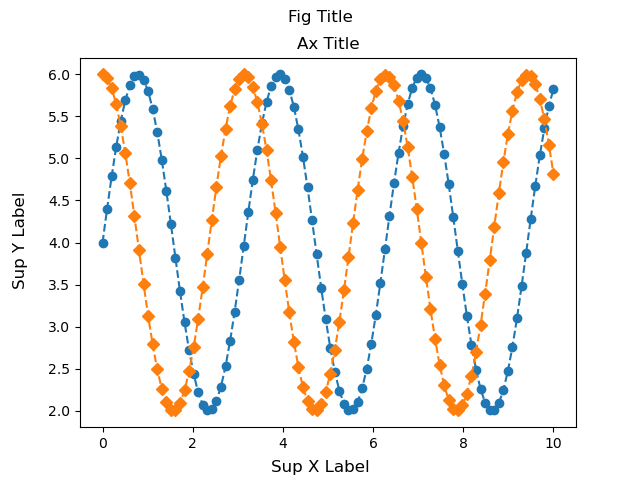
凡例 (Axes.legend)
グラフの凡例は,FigureとAxesのそれぞれに設定することができます
本記事ではAxesのみについて解説します
- 引数
- 返値
- 公式ドキュメント
下記のタブにplt_legendとフローチャートの解説をしています
import matplotlib.pyplot as plt
import numpy as np


def plt_legend():
    x = np.linspace(0, 10, 100)
    y1 = 4 + 2 * np.sin(2 * x)
    y2 = 4 + 2 * np.cos(2 * x)

    fig, ax = plt.subplots()

    ax.plot(x, y1, 'o--', label='Sample 1')
    ax.plot(x, y2, 'D--', label='Sample 2')

    ax.set_title('Default')
    fig.suptitle('Legend')

    ax.set_xlabel('X Label')
    ax.set_ylabel('Y Label')

    ax.legend()

    plt.show()


if __name__ == '__main__':
    plt_legend()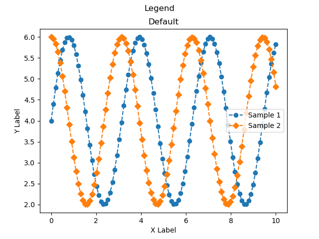
凡例の完全な制御方法 (handles, labels)
グラフの凡例はより詳細にコントロールすることができます
- handles : 凡例を使用するAxesオブジェクトを指定
- labels : 表示される凡例のラベルを指定
用途としては,下記記事のような場合があります

handlesでは,Axesオブジェクトをリストで指定することで,特定の凡例のみを指定することができます
line1, = ax.plot(x, y1, 'o--', label='Sample 1')
line2, = ax.plot(x, y2, 'D--', label='Sample 2')

ax.legend(handles=[line1, line2])
labelsでは,ラベルを配列で指定することで,凡例に表示されるテキストを指定できます
ax.plot(x, y1, 'o--')
ax.plot(x, y2, 'D--')

ax.legend(labels=['Sample 1', 'Sample 2'])
凡例をグラフ内に配置 (loc)
凡例をグラフ内に配置する際に,locを使用すると簡単に位置を指定できます
best, upper, lower, left, rightとそれらの組み合わせから選択できます
下記のタブにplt_legend_locとフローチャートの解説をしています
import matplotlib.pyplot as plt
import numpy as np


def plt_legend_loc():
    x = np.linspace(0, 10, 100)
    y1 = 4 + 2 * np.sin(2 * x)
    y2 = 4 + 2 * np.cos(2 * x)

    fig, axs = plt.subplots(2, 2, sharex=True, sharey=True)

    locs = ['best', 'lower right', 'center', 'upper left']
    for ax, loc in zip(axs.flat, locs):
        ax.plot(x, y1, 'o--', label='Sample 1')
        ax.plot(x, y2, 'D--', label='Sample 2')

        ax.set_title(loc)
        ax.legend(loc=loc)

    fig.suptitle('Legend')
    fig.supxlabel('X label')
    fig.supylabel('Y label')

    plt.show()


if __name__ == '__main__':
    plt_legend_loc()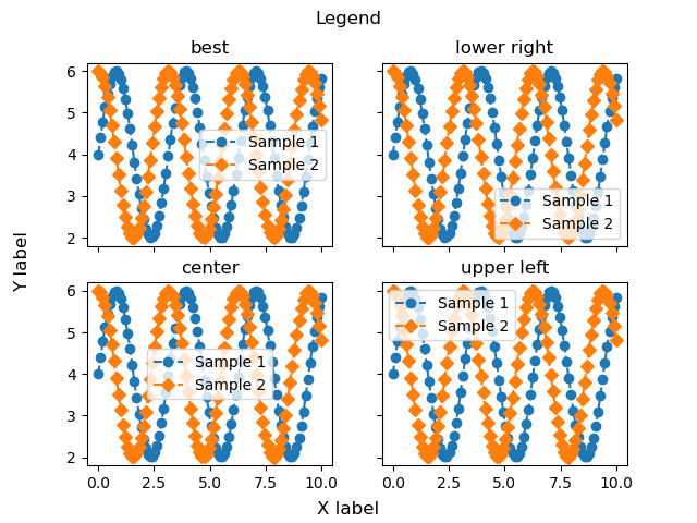
凡例をグラフ外に配置 (bbox_to_anchor)
凡例をグラフ外に配置する際に,bbox_to_anchorとlocを組み合わせることで位置を指定できます
bbox_to_anchorは,(x, y)もしくは(x, y, width, height)で座標を指定します.
xy座標は,グラフの左下が(0, 0)で,グラフの右上が(1, 1)となっています
本記事では,グラフの右上から少し右側にシフトするために(1.05, 1)としました
下記のタブにplt_legend_bboxとフローチャートの解説をしています
import matplotlib.pyplot as plt
import numpy as np


def plt_legend_bbox():
    x = np.linspace(0, 10, 100)
    y1 = 4 + 2 * np.sin(2 * x)
    y2 = 4 + 2 * np.cos(2 * x)

    fig, ax = plt.subplots()

    ax.plot(x, y1, 'o--', label='Sample 1')
    ax.plot(x, y2, 'D--', label='Sample 2')

    ax.set_title('Bbox')
    fig.suptitle('Legend')

    ax.set_xlabel('X Label')
    ax.set_ylabel('Y Label')

    ax.legend(bbox_to_anchor=(1.05, 1), loc='upper left')

    plt.tight_layout()
    plt.show()


if __name__ == '__main__':
    plt_legend_bbox()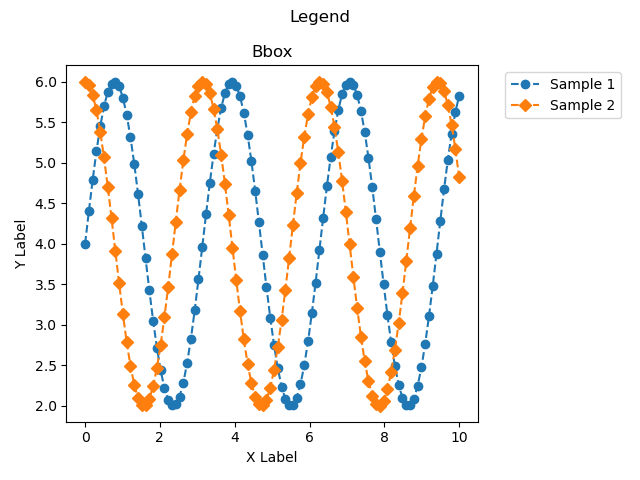
軸数値の設定 (Axes.set_xlim, Axes.set_ylim)
軸の上限と下限をAxes.set_xlimとAxes.set_ylimで設定できます
本記事では,xとyの両方とも,(0, 8)としました
- 引数
-
- left, right (float) : グラフの座標の上限と下限を設定できます.leftのみの指定もできます
- auto (True or False) : オートスケーリングをオンにするかどうかを指定します.True はオン,False はオフ,None は未変更です
- xmin, xmax (float) : それぞれleftとrightに相当し,xminとleft,xmaxとrightの両方を渡すとエラーとなります
- 返値
-
- left, right
- 公式ドキュメント
下記のタブにplt_limとフローチャートの解説をしています
import matplotlib.pyplot as plt
import numpy as np


def plt_lim():
    x = np.linspace(0, 10, 100)
    y1 = 4 + 2 * np.sin(2 * x)
    y2 = 4 + 2 * np.cos(2 * x)

    fig, ax = plt.subplots()

    ax.plot(x, y1, 'o--', label='Sample 1')
    ax.plot(x, y2, 'D--', label='Sample 2')

    ax.set_title('Default')
    fig.suptitle('Lim')

    ax.set_xlabel('X Label')
    ax.set_ylabel('Y Label')

    ax.set_xlim(0, 8)
    ax.set_ylim(0, 8)

    ax.legend()

    plt.show()


if __name__ == '__main__':
    plt_lim()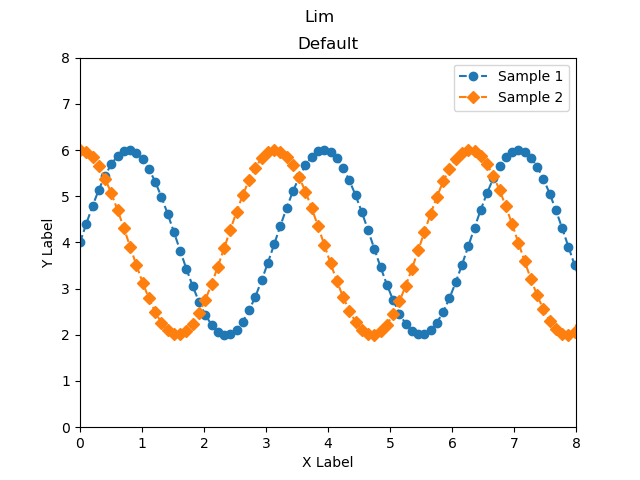
対数軸などの軸スケール (Axes.set_xscale, Axes.set_yscale)
軸のスケールは,X軸ではAxes.set_xscale,Y軸ではAxes.set_yscaleで設定できます
本記事では,axs[1].set_yscale(‘log’)とY軸のみを対数にして解説しています
- 引数
-
- value (ScaleBase) : “linear”, “log”, “symlog”, “logit“などから設定できます
- 返値
-
- 特になし
- 公式ドキュメント
下記のタブにplt_scaleとフローチャートの解説をしています
import matplotlib.pyplot as plt
import numpy as np


def plt_scale():
    x = np.linspace(0, 10, 100)
    y1 = np.exp(x) + 2 * np.sin(2 * x)
    y2 = np.exp(x) + 2 * np.cos(2 * x)

    fig, axs = plt.subplots(1, 2, sharex=True)

    for ax in axs.flat:
        ax.plot(x, y1, label='Sample 1')
        ax.plot(x, y2, label='Sample 2')
        ax.legend()

    axs[0].set_title('linear')
    axs[1].set_title('log')

    fig.suptitle('scale')
    fig.supxlabel('X label')
    fig.supylabel('Y label')

    axs[1].set_yscale('log')

    plt.show()


if __name__ == '__main__':
    plt_scale()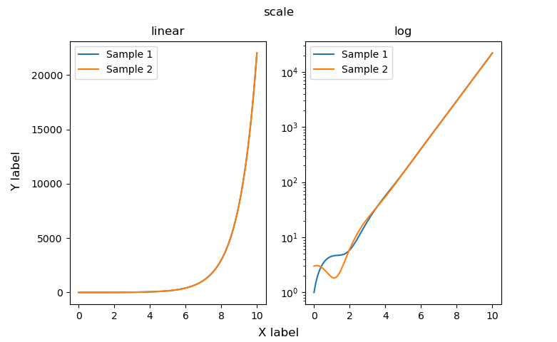
参考文献
Matplotlibの公式ドキュメント
お疲れ様でした
コメント