\ 迷ったらまずTechAcademyの無料カウンセリング! /
【Matplotlib】科学論文のグラフ体裁を一括設定する方法 (rcParams)
PythonのMatplotlibでグラフを作成する際に,グラフ体裁を整えるのに毎回苦労していませんか?
実はMatplotlibでは,グラフの体裁を一括で整えることができるrcParamsというライブラリが用意されています
そして,そのライブラリとクラスによる記述方法を組み合わせることで,グラフ体裁を毎回設定する必要がなくなります
本記事では科学論文用の体裁に的を絞り,クラスを使って一括で整える方法について解説しています
コードはコピー&ペーストでそのまま使えるようになっているので,ぜひご自分のPCで試してみてください
目次
折れ線グラフ (Axes.plot)
Matplotlibで折れ線グラフ(散布図も書けます)を表示するには,Axes.plot関数を用います
Axes.plotに,yのみを入力すると等間隔にyの値がグラフ上に表示されますが,xとyの両方を入力すると散布図のように,x対yのグラフになります
Axes.plot
- 引数
-
- x, y (配列 or 値) : データの座標を指定します.yのみの指定であれば,xには[0~yの数]の配列が指定されます.
- fmt (文字列) : フォーマット文字列で,線種,線色,マーカーを一度に指定可能です
- label (配列) : ラベルを配列で指定できます
- linestyle (文字列) : 線のスタイルを,[– (solid), — (dashed), -. (dashdot), : (dotted), (None)]から指定できます
- linewidth (float) : 線の太さを数値で指定できます
- alpha (float) : 透明度を0~1の範囲内の数値で指定できます
- marker (文字列) : マーカーの種類を,matplotlib.markersに記載されている文字列を入力して選ぶことができます
- markerfacecolor (color) : マーカーのメインの色を指定できます
- markeredgecolor (color) : マーカーの枠の色を指定できます
- markeredgewidth (float) : マーカーの枠の太さを数値で指定できます
- fillstyle (文字列) : マーカーの塗りつぶす領域を,full, left, right, bottom, top, noneの内から選ぶことができます
- 返値
-
- Line2Dのリスト
- 公式ドキュメント
Axes.plot関数による折れ線グラフ
Axes.plot関数を用いることで折れ線グラフを表示することができます
下記のタブにplt_lineとフローチャートの解説をしています
import matplotlib.pyplot as plt
import numpy as np

class ThesisFormat:
    def __init__(self) -> None:
        self.plt_style()

    def plt_style(self):
        plt.rcParams['figure.autolayout'] = True
        plt.rcParams['figure.figsize'] = [6.4, 4.8]
        plt.rcParams['font.family'] ='Times New Roman'
        plt.rcParams['font.size'] = 12
        plt.rcParams['xtick.direction'] = 'in'
        plt.rcParams['ytick.direction'] = 'in'
        plt.rcParams['axes.linewidth'] = 1.0
        plt.rcParams['errorbar.capsize'] = 6
        plt.rcParams['lines.markersize'] = 6
        plt.rcParams['lines.markerfacecolor'] = 'white'
        plt.rcParams['mathtext.fontset'] = 'cm'
        self.line_styles = ['-', '--', '-.', ':']
        self.markers = ['o', 's', '^', 'D', 'v', '<', '>', '1', '2', '3']

    def plt_line(self):
        x = np.linspace(0, 10, 100)
        y1 = 4 + 2 * np.sin(2 * x)
        y2 = 4 + 2 * np.cos(2 * x)

        fig, ax = plt.subplots()

        ax.plot(x, y1, linestyle=self.line_styles[0], label='Sample 1')
        ax.plot(x, y2, linestyle=self.line_styles[1], label='Sample 2')

        ax.set_xlim(0, 8)
        ax.set_ylim(0, 8)
        ax.set_xlabel('X label')
        ax.set_ylabel('Y label')
        ax.legend()

        ax.set_title('Simple line')

        plt.show()

if __name__ == '__main__':
    thesis_format = ThesisFormat()
    thesis_format.plt_line()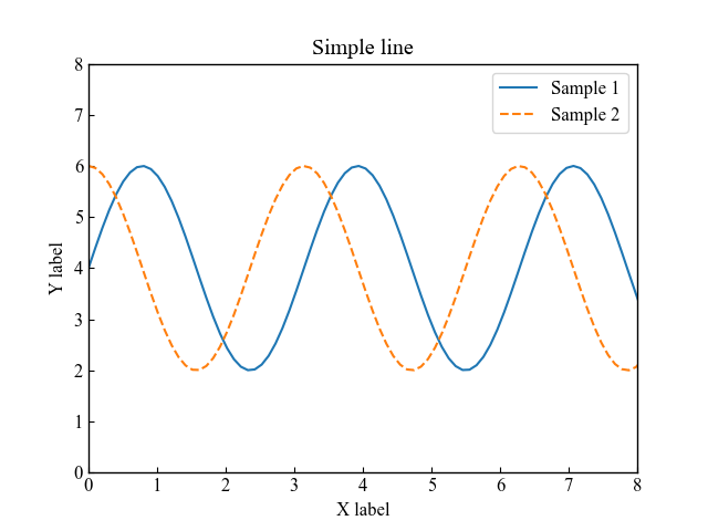
Axes.plot関数によるマーカー付き折れ線グラフ
Axes.plot関数でマーカー付き折れ線グラフを表示するには,マーカーを指定します
fmt(フォーマット文字列)で線種,マーカーを指定しています
また,plt.rcParams[‘lines.markerfacecolor’] = ‘white’で白塗りしています
下記のタブにplt_line_markerとフローチャートの解説をしています
import matplotlib.pyplot as plt
import numpy as np

class ThesisFormat:
    def __init__(self) -> None:
        self.plt_style()

    def plt_style(self):
        plt.rcParams['figure.autolayout'] = True
        plt.rcParams['figure.figsize'] = [6.4, 4.8]
        plt.rcParams['font.family'] ='Times New Roman'
        plt.rcParams['font.size'] = 12
        plt.rcParams['xtick.direction'] = 'in'
        plt.rcParams['ytick.direction'] = 'in'
        plt.rcParams['axes.linewidth'] = 1.0
        plt.rcParams['errorbar.capsize'] = 6
        plt.rcParams['lines.markersize'] = 6
        plt.rcParams['lines.markerfacecolor'] = 'white'
        plt.rcParams['mathtext.fontset'] = 'cm'
        self.line_styles = ['-', '--', '-.', ':']
        self.markers = ['o', 's', '^', 'D', 'v', '<', '>', '1', '2', '3']

    def plt_line_marker(self):
        x = np.linspace(0, 10, 30)
        y1 = 4 + 2 * np.sin(2 * x)
        y2 = 4 + 2 * np.cos(2 * x)

        fig, ax = plt.subplots()

        ax.plot(x, y1, self.markers[0]+'--', label='Sample 1')
        ax.plot(x, y2, self.markers[1]+'--', label='Sample 2')

        ax.set_xlim(0, 8)
        ax.set_ylim(0, 8)
        ax.set_ylabel('Y label')
        ax.set_xlabel('X label')
        ax.legend()

        ax.set_title('Markered line')
        fig.suptitle('Fig Title')

        plt.show()

if __name__ == '__main__':
    thesis_format = ThesisFormat()
    thesis_format.plt_line_marker()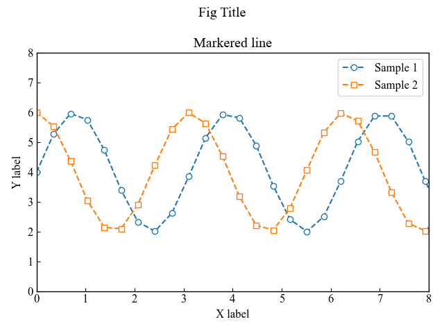
あわせて読みたい

【Matplotlib】折れ線グラフや散布図!線種,線色,マーカー (plot)
Pythonでデータを可視化するためにグラフを描画したいと思ったことはありませんか? PythonにはMatplotlibというグラフを作るための優れたライブラリがあります Matplot…
凡例がグラフ外にある散布図 (Axes.scatter)
Axes.scatter関数を用いると散布図を描くことができます
xとyにそれぞれ同じ要素数の配列を指定すれば表示されます
Axes.scatter
- 引数
-
- x, y (float or 配列) : データの座標を指定します
- s (float or 配列) : マーカーのサイズを数値で指定できます
- c (配列) : マーカーの色を変更できます.指定の色の文字列やRGBを入力します.cmapを指定した場合は,数値の配列を入力します
- marker (MarkerStyle) : マーカーの種類を指定できます.大きく分けると塗りつぶした系と塗りつぶさない系があります.
- cmap (Colormap) : カラーマップを指定して,数値に合わせて色が変わるようにできます
- vmax, vmin (float) : cmapを指定した際に,カラーマップの範囲を指定できます
- alpha (float) : マーカーの透明度を0~1の範囲内で指定できます
- linewidth (float or 配列) : マーカーの枠の太さを数値で指定できます
- edgecolor (color) : マーカーの枠の色を自由に変更できます
- 返値
- 公式ドキュメント
Axes.scatter関数による透明度をもつ散布図 (alpha)
散布図に複数の要素がある場合に,重なり合ってもわかりやすくするのは重要です
そこでマーカーに透明度を持たせることで,重なっていることがわかるようにしました
下記のタブにplt_scatterとフローチャートの解説をしています
import matplotlib.pyplot as plt
import numpy as np

class ThesisFormat:
    def __init__(self) -> None:
        self.plt_style()

    def plt_style(self):
        plt.rcParams['figure.autolayout'] = True
        plt.rcParams['figure.figsize'] = [6.4, 4.8]
        plt.rcParams['font.family'] ='Times New Roman'
        plt.rcParams['font.size'] = 12
        plt.rcParams['xtick.direction'] = 'in'
        plt.rcParams['ytick.direction'] = 'in'
        plt.rcParams['axes.linewidth'] = 1.0
        plt.rcParams['errorbar.capsize'] = 6
        plt.rcParams['lines.markersize'] = 6
        plt.rcParams['lines.markerfacecolor'] = 'white'
        plt.rcParams['mathtext.fontset'] = 'cm'
        self.line_styles = ['-', '--', '-.', ':']
        self.markers = ['o', 's', '^', 'D', 'v', '<', '>', '1', '2', '3']

    def plt_scatter(self):
        np.random.seed(19680801)

        x = np.random.randn(100)
        y1 = np.random.randn(100)
        y2 = np.random.randn(100)

        fig, ax = plt.subplots()

        ax.scatter(x, y1, alpha=0.5, label='Sample1')
        ax.scatter(x, y2, alpha=0.5, label='Sample2', marker=self.markers[1])

        ax.set_ylabel('Y label')
        ax.set_xlabel('X label')
        ax.legend(bbox_to_anchor=(1.05, 1), loc='upper left')
        ax.set_title('Simple scatter')

        plt.show()

if __name__ == '__main__':
    thesis_format = ThesisFormat()
    thesis_format.plt_scatter()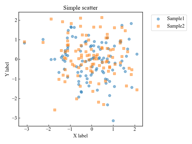
Axes.scatter関数による枠の色のみの散布図 (edgecolor)
散布図に複数の要素がある場合に,グラフが美しくなくなることはよくあります
そこで塗りつぶしをやめて,枠の色だけにすることが可能です
下記のタブにplt_scatter_edgeとフローチャートの解説をしています
import matplotlib.pyplot as plt
import numpy as np

class ThesisFormat:
    def __init__(self) -> None:
        self.plt_style()

    def plt_style(self):
        plt.rcParams['figure.autolayout'] = True
        plt.rcParams['figure.figsize'] = [6.4, 4.8]
        plt.rcParams['font.family'] ='Times New Roman'
        plt.rcParams['font.size'] = 12
        plt.rcParams['xtick.direction'] = 'in'
        plt.rcParams['ytick.direction'] = 'in'
        plt.rcParams['axes.linewidth'] = 1.0
        plt.rcParams['errorbar.capsize'] = 6
        plt.rcParams['lines.markersize'] = 6
        plt.rcParams['lines.markerfacecolor'] = 'white'
        plt.rcParams['mathtext.fontset'] = 'cm'
        self.line_styles = ['-', '--', '-.', ':']
        self.markers = ['o', 's', '^', 'D', 'v', '<', '>', '1', '2', '3']

    def plt_scatter_edge(self):
        np.random.seed(19680801)

        x = np.random.randn(100)
        num = 5
        ys = [np.random.randn(100) for _ in range(num)]

        fig, ax = plt.subplots()

        for i, y in enumerate(ys):
            ax.scatter(x, y, label='Sample '+str(i+1), c='white', edgecolor='C'+str(i), marker=self.markers[i])

        ax.set_ylabel('Y label')
        ax.set_xlabel('X label')
        ax.legend(bbox_to_anchor=(1.05, 1), loc='upper left')
        ax.set_title('Edgecolor scatter')

        plt.show()

if __name__ == '__main__':
    thesis_format = ThesisFormat()
    thesis_format.plt_scatter_edge()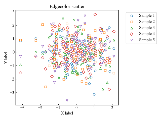
あわせて読みたい

【Matplotlib】散布図やバブルチャートを描画する方法 (scatter)
散布図やバブルチャートを作成してデータの関係性や分布を視覚化したいれど,どのようにして実現できるか迷っていませんか? データのパターンや相関を的確に表現するグ…
棒グラフ (Axes.bar, Axes.bar_label)
Matplotlibで棒グラフを表示するには,Axes.bar関数を用います
棒グラフのyの高ささえあれば描画できてしまいます
Axes.bar (x, height, width, bottom, align, **kwargs)
- 引数
-
- x (float or 配列):棒グラフの位置をx座標で指定します
- height (float or 配列):棒グラフの高さになります
- width (float or 配列):棒グラフの幅を変えられ,脚
- bottom (float or 配列):棒グラフの始点をy座標で指定します
- align (文字列):x座標にどう配置するかを決定し,centerかedgeを入力します
- xerr, yerr (float or 配列):数値に合わせて+/-のサイズで作成されます
- color (color or color配列):棒グラフの表面の色の指定します
- edgecolor (color or color配列):棒グラフの枠の色を変えられます
- linewidth (float):枠の線の太さを指定できます
- ecolor (color or color配列):エラーバーの色を指定します
- capsize (float):エラーバーの傘部分のサイズ指定をします.本記事では,plt.rcParams[‘errorbar.capsize’] = 3として統一していました.
- log (bool):TrueかFalseで対数スケールにするか選べます
- **kwargs:ほかにも様々な引数がありますので,公式ドキュメントを参考にしてください
- 返値
- 公式ドキュメント
ラベル付きの一般的な棒グラフ
データが1つだけの最も一般的なラベル付き棒グラフを描画します
下記のタブにplt_barとフローチャートの解説をしています
import matplotlib.pyplot as plt
import numpy as np

class ThesisFormat:
    def __init__(self) -> None:
        self.plt_style()

    def plt_style(self):
        plt.rcParams['figure.autolayout'] = True
        plt.rcParams['figure.figsize'] = [6.4, 4.8]
        plt.rcParams['font.family'] ='Times New Roman'
        plt.rcParams['font.size'] = 12
        plt.rcParams['xtick.direction'] = 'in'
        plt.rcParams['ytick.direction'] = 'in'
        plt.rcParams['axes.linewidth'] = 1.0
        plt.rcParams['errorbar.capsize'] = 6
        plt.rcParams['lines.markersize'] = 6
        plt.rcParams['lines.markerfacecolor'] = 'white'
        plt.rcParams['mathtext.fontset'] = 'cm'
        self.line_styles = ['-', '--', '-.', ':']
        self.markers = ['o', 's', '^', 'D', 'v', '<', '>', '1', '2', '3']

    def plt_bar(self):
        labels = ['G1', 'G2', 'G3', 'G4', 'G5']
        men_means = [20, 34, 30, 35, 27]
        men_std = [2, 3, 4, 1, 2]

        x = np.arange(len(labels))

        fig, ax = plt.subplots()
        bar = ax.bar(x, men_means, label='Men', tick_label=labels, yerr=men_std)

        labels = [str(m) + ' ± ' + str(s) for m, s in zip(men_means, men_std)]
        ax.bar_label(bar, labels=labels)

        ax.set_xlabel('X label')
        ax.set_ylabel('Y label')
        ax.set_title('Basic bar')
        ax.legend()

        plt.show()

if __name__ == '__main__':
    thesis_format = ThesisFormat()
    thesis_format.plt_bar()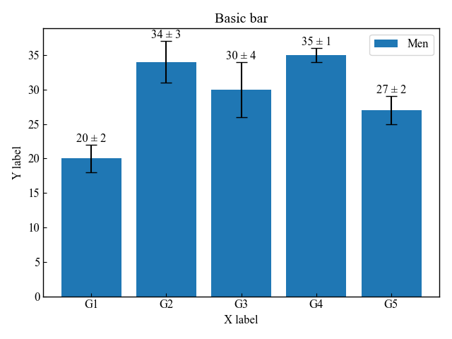
グループ化棒グラフと積み上げ式棒グラフ
グループ化棒グラフは,widthで幅を指定して位置を調整します
積み上げ式棒グラフはbottomを指定して,2番目のデータの始点を変更します
下記のタブにplt_bar_group_stackとフローチャートの解説をしています
import matplotlib.pyplot as plt
import numpy as np

class ThesisFormat:
    def __init__(self) -> None:
        self.plt_style()

    def plt_style(self):
        plt.rcParams['figure.autolayout'] = True
        plt.rcParams['figure.figsize'] = [6.4, 4.8]
        plt.rcParams['font.family'] ='Times New Roman'
        plt.rcParams['font.size'] = 12
        plt.rcParams['xtick.direction'] = 'in'
        plt.rcParams['ytick.direction'] = 'in'
        plt.rcParams['axes.linewidth'] = 1.0
        plt.rcParams['errorbar.capsize'] = 6
        plt.rcParams['lines.markersize'] = 6
        plt.rcParams['lines.markerfacecolor'] = 'white'
        plt.rcParams['mathtext.fontset'] = 'cm'
        self.line_styles = ['-', '--', '-.', ':']
        self.markers = ['o', 's', '^', 'D', 'v', '<', '>', '1', '2', '3']

    def plt_bar_group_stack(self):
        labels = ['G1', 'G2', 'G3', 'G4', 'G5']
        men_means = [20, 34, 30, 35, 27]
        women_means = [25, 32, 34, 20, 25]

        x = np.arange(len(labels))
        width = 0.4

        fig, axs = plt.subplots(1, 2, sharey=True)
        # グループ化棒グラフ
        group1 = axs[0].bar(x - width/2, men_means, width, label='Men')
        group2 = axs[0].bar(x + width/2, women_means, width, label='Women')

        # 積み上げ式棒グラフ
        stack1 = axs[1].bar(labels, men_means, width, label='Men')
        stack2 = axs[1].bar(labels, women_means, width, bottom=men_means, label='Women')

        # グループ化棒グラフのラベル
        axs[0].bar_label(group1, labels=men_means)
        axs[0].bar_label(group2, labels=women_means)

        # 積み上げ式棒グラフのラベル
        axs[1].bar_label(stack1, fmt='%.1f')
        axs[1].bar_label(stack2, fmt='%.1f')

        axs[0].set_ylabel('Y label')
        axs[0].set_title(f'Grouped Bar')
        axs[1].set_title(f'Stacked Bar')

        for ax in axs.flat:
            ax.set_xticks(x, labels)
            ax.set_xlabel('X label')
            ax.legend()

        fig.suptitle('Bar for a Thesis')
        plt.show()

if __name__ == '__main__':
    thesis_format = ThesisFormat()
    thesis_format.plt_bar_group_stack()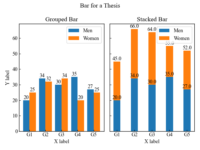
あわせて読みたい
【Matplotlib】棒グラフとカスタム方法の徹底解説 (bar, barh, bar_label)
棒グラフはとても一般的なデータ可視化の方法で,よく用いられています Matplotlibでは棒グラフを数行のコードで簡単に表示することができます. 本記事では,一般的な…
階段状グラフ (Axes.step)
Axes.step関数を用いると階段グラフを描画することができます
Axes.step (x, y, fmt, where=’pre’)
import matplotlib.pyplot as plt
import numpy as np

class ThesisFormat:
    def __init__(self) -> None:
        self.plt_style()

    def plt_style(self):
        plt.rcParams['font.family'] ='Times New Roman'
        plt.rcParams['xtick.direction'] = 'in'
        plt.rcParams['ytick.direction'] = 'in'
        plt.rcParams['font.size'] = 12
        plt.rcParams['axes.linewidth'] = 1.0
        plt.rcParams['errorbar.capsize'] = 6
        plt.rcParams['lines.markersize'] = 7
        plt.rcParams['mathtext.fontset'] = 'cm'
        self.line_styles = ['-', '--', '-.', ':']
        self.markers = ['o', ',', '.', 'v', '^', '<', '>', '1', '2', '3', '.', ',', 'o', 'v', '^', '<', '>', '1', '2', '3']

    def plt_step(self):
        # step1 データの作成
        x = np.arange(10)
        y = np.sin(x)

        # step2 グラフフレームの作成
        fig, ax = plt.subplots()

        # step3 階段グラフの描画
        ax.step(x, y, 'o-' ,label='circle')
        ax.step(x, y+2, 's-' ,label='square')
        ax.step(x, y+4, '^-' ,label='triangle_up')

        ax.set_xlabel('X label')
        ax.set_ylabel('Y label')
        ax.legend()
        ax.set_title('Step Line Chart')

        plt.show()

if __name__ == '__main__':
    thesis_format = ThesisFormat()
    thesis_format.plt_step()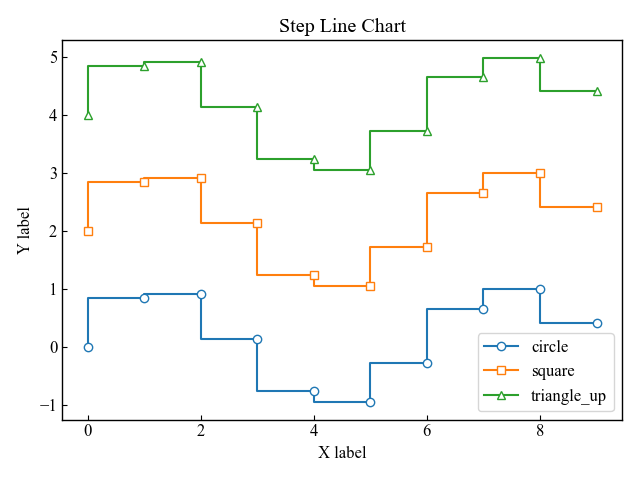
あわせて読みたい

【Matplotlib】階段グラフ(ステップグラフ)を表示する (step)
階段グラフはステップグラフとも呼ばれ,データ間を垂直線と平行線で繋げたグラフです データのトレンド,変化のパターン,ステップ関数の可視化などに使用されます.特…
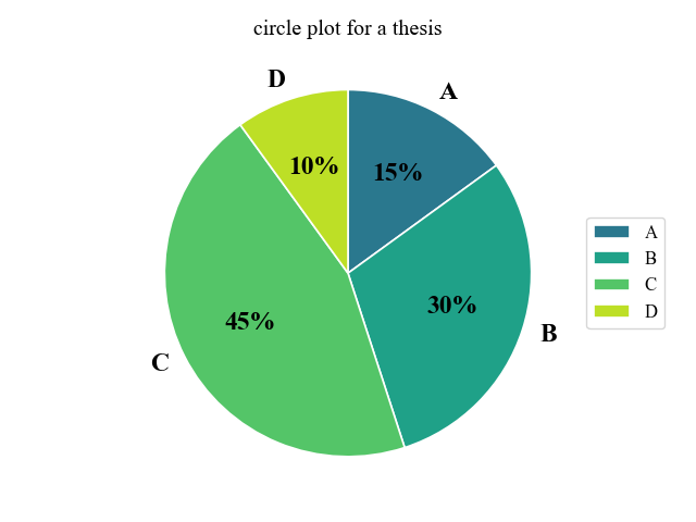
円グラフ (axes.pie)
Matplotlibでは,一般的な円グラフはAxes.pieを使って描画します
Axes.pie
- 引数
-
- x (配列):1次元配列で指定する円グラフの各要素
- explode (配列):グラフの中心からの各要素の距離の割合
- labels (リスト):各要素のラベル
- colors (配列):グラフの色
- autopct (文字列, 関数):ラベルを数値割合で表示
- pctdistance (float):グラフの中心とautopct が生成するテキスト位置との比率
- shadow (bool):グラフの影
- labeldistance (float):ラベルの距離
- counterclock (bool):要素の方向.時計回りか反時計回りか
- startangle (float):グラフの始点のx軸から反時計回りの回転角度
- radius (float):グラフの半径
- wedgeprops (dict):各要素(wedge)を辞書形式でカスタマイズ
- textprops (dict):テキスト要素を辞書形式でカスタマイズ
- center ((float, float)):グラフの中心の座標
- frame (bool):グラフの軸
- rotatelabels (bool):各ラベルの回転
- normalize (bool):グラフの数値の正規化
- 返値
-
- patches (リスト):matplotlib.patches.Wedgeの配列
- texts (リスト):ラベルTextのリスト
- autotexts (リスト):数値ラベル用のTextリスト.autopct が Noneでない場合にのみ
- 公式ドキュメント
下記のタブにコードとフローチャートの解説をしています
import matplotlib.pyplot as plt
import numpy as np

class ThesisFormat:
    def __init__(self) -> None:
        self.plt_style()

    def plt_style(self):
        plt.rcParams['figure.autolayout'] = True
        plt.rcParams['figure.figsize'] = [6.4, 4.8]
        plt.rcParams['font.family'] ='Times New Roman'
        plt.rcParams['font.size'] = 12
        plt.rcParams['xtick.direction'] = 'in'
        plt.rcParams['ytick.direction'] = 'in'
        plt.rcParams['axes.linewidth'] = 1.0
        plt.rcParams['errorbar.capsize'] = 6
        plt.rcParams['lines.markersize'] = 6
        plt.rcParams['lines.markerfacecolor'] = 'white'
        plt.rcParams['mathtext.fontset'] = 'cm'
        self.line_styles = ['-', '--', '-.', ':']
        self.markers = ['o', 's', '^', 'D', 'v', '<', '>', '1', '2', '3']

    def plt_circle(self):
        labels = ['A', 'B', 'C', 'D']
        sizes = [15, 30, 45, 10]

        fig, ax = plt.subplots()
        # カラーマップの指定
        cmap = plt.colormaps['viridis']
        colors = cmap((np.linspace(0.4, 0.9, len(sizes))))
        # 円グラフの描画
        ax.pie(sizes, labels=labels, autopct='%.0f%%', startangle=90, counterclock=False, normalize=True,
            colors=colors,
            wedgeprops = {'edgecolor': 'white', 'linewidth': 1.2},
            textprops={'fontsize': 17, 'fontweight': 'bold', 'family': 'Times new roman'}
        )

        ax.set_title('circle plot for a thesis')
        ax.legend(loc='center left', bbox_to_anchor=(1, 0, 0.5, 1))

        plt.show()

if __name__ == '__main__':
    thesis_format = ThesisFormat()
    thesis_format.plt_circle()
あわせて読みたい
【Matplotlib】円グラフを徹底解説!凡例,割合%,ラベル (pie)
データの割合を表示する際に,円グラフがよく使われています 本記事ではMatplotlibで凡例付きの円グラフを描画する方法について解説します 円グラフの凡例やラベル,パ…
等高線グラフ (Axes.contour)
Matplotlibで等高線グラフを表示する際には,Axes.contour関数を使います
XとYは,numpy.meshgrid関数で処理し160行240列の行列,Zにはグリッドデータから作成した等高線の高さを表す160行240列の行列になります
Axes.contour (X, Y, Z, levels, **kwargs)
- 引数
-
- X (配列):Zの値の座標で,XとYは両方ともZと同じ形状の2次元です
- Y (配列):X と Y は等間隔に値が並んでいる必要があります
- Z (配列):等高線の高さになります
- levels (int or 配列):等高線の数や間隔を指定できます
- **kwargs:ほかにも様々な引数がありますので,公式ドキュメントを参考にしてください
- 返値
- 公式ドキュメント
下記のタブにplt_contourとグラフデータ,フローチャートの解説をしています
import matplotlib.pyplot as plt
import numpy as np

class ThesisFormat:
    def __init__(self) -> None:
        self.plt_style()

    def plt_style(self):
        plt.rcParams['figure.autolayout'] = True
        plt.rcParams['figure.figsize'] = [6.4, 4.8]
        plt.rcParams['font.family'] ='Times New Roman'
        plt.rcParams['font.size'] = 12
        plt.rcParams['xtick.direction'] = 'in'
        plt.rcParams['ytick.direction'] = 'in'
        plt.rcParams['axes.linewidth'] = 1.0
        plt.rcParams['errorbar.capsize'] = 6
        plt.rcParams['lines.markersize'] = 6
        plt.rcParams['lines.markerfacecolor'] = 'white'
        plt.rcParams['mathtext.fontset'] = 'cm'
        self.line_styles = ['-', '--', '-.', ':']
        self.markers = ['o', 's', '^', 'D', 'v', '<', '>', '1', '2', '3']

    def plt_contour(self):
        delta = 0.025
        x = np.arange(-3.0, 3.0, delta)
        y = np.arange(-2.0, 2.0, delta)
        X, Y = np.meshgrid(x, y)
        Z1 = np.exp(-X**2 - Y**2)
        Z2 = np.exp(-(X - 1)**2 - (Y - 1)**2)
        Z = Z1 - Z2

        fig, ax = plt.subplots()
        # 等高線のラベル
        CS = ax.contour(X, Y, Z, colors='black')
        ax.clabel(CS, inline=True)

        # 等高線の塗りつぶし
        CSf = ax.contourf(X, Y, Z)

        # カラーバーの設定
        cbar = fig.colorbar(CSf)
        cbar.ax.set_ylabel('Z Label')
        cbar.add_lines(CS)

        ax.set_xlabel('X Label')
        ax.set_ylabel('Y Label')
        ax.set_title('Simple Contour')
        plt.show()

if __name__ == '__main__':
    thesis_format = ThesisFormat()
    thesis_format.plt_contour()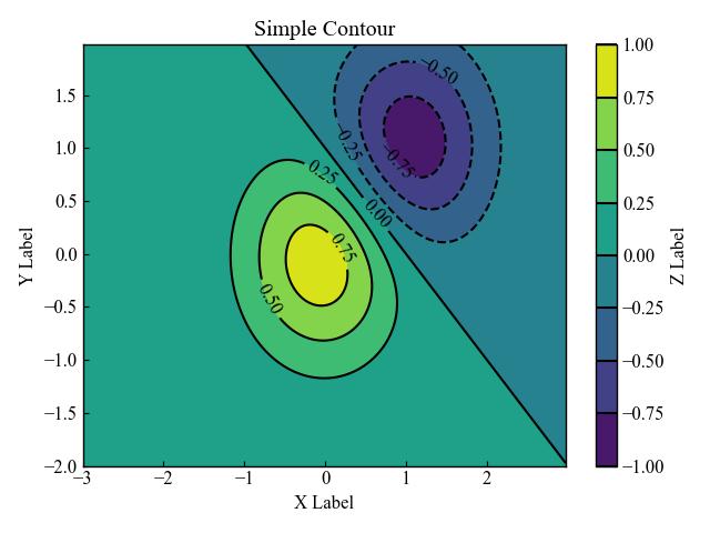
あわせて読みたい

【Matplotlib】カラーバー付き等高線グラフを表示する方法 (contour, contourf, plot_surface)
等高線グラフの作成について悩んでいませんか?データの密度やパターンを的確に表現するためには、正しい方法で等高線グラフを作成する必要があります Matplotlibであれ…
クラスを用いたグラフ表示方法の解説 (matplotlib.rcParams)
論文のグラフフォーマットを様々なクラスに適用させるために,matplotlib.rcParamsを使います
クラスは最初理解するのはとても難しいため,どのようにコードが動いているのかを解説します
Axes.plot関数による折れ線グラフの場合を例にしています
クラスの構成
クラスはThesisFormatという名前で,関数は3つあります
特に引数は何も用意しておらず,クラス自身にあたるselfのみです
selfを使うと,クラス内のどこの関数でも使うことができます
クラスの構成
- クラス
-
- ThesisFormat
- 関数
-
- __init__(self) : クラスを呼び出すと,最初に実行される関数です
- plt_style(self) : グラフの体裁を一括で整えてくれる関数です
- plt_line(self) : 実際にグラフを描画している関数です
クラスの呼び出しとグラフ描画の実行
if name == ‘main’:以下でクラスの呼び出しとグラフ描画の実行をしています
クラスの呼び出しとグラフ描画
- クラスの呼び出し
-
- クラスを呼び出して,thesis_formatという変数に置き換えています
- グラフ描画
-
- クラス内の関数plt_line()を実行してグラフ描画をします
参考文献
matplotlib.rcParamsの公式ドキュメント
[Python] matplotlib: 論文用に図の体裁を整える – Qiita
お疲れ様でした