Bar charts are a very common and popular method of data visualization
Matplotlib makes it easy to plot bar charts with just a few lines of code.
This article describes how to plot general bar charts, stacked bar charts, grouped bar charts, and horizontal bar charts.
I also explained in detail how to label bar charts, set up error bars, and customize colors.
General bar chart (Axes.bar)
To plot a bar chart in Matplotlib, use the Axes.bar function
You can draw a bar graph with only the y height
- Parameters
-
- x (float or array) : The x coordinates of the bars.
- height (float or array) : The height(s) of the bars.
- width (float or array) : The width(s) of the bars.
- bottom (float or array) : The y coordinate(s) of the bottom side(s) of the bars.
- align (str):Alignment of the bars to the x coordinates: center or edge
- xerr, yerr (float or array) : Horizontal / Vertical errorbars. The values are +/- sizes relative to the data:
- color (color or list of color) : The colors of the bar faces.
- edgecolor (color or list of color) : The colors of the bar edges.
- linewidth (float) : Width of the bar edge(s). If 0, don’t draw edges.
- ecolor (color or list of color) : The line color of the errorbars.
- capsize (float):The length of the error bar caps in points.
- log (bool) : If True, set the y-axis to be log scale.
- Returns
-
- BarContainer : Container with all the bars and optionally errorbars.
- Official Documentation
The following tabs explain the code and flowchart
import matplotlib.pyplot as plt
import numpy as np

# step1 Create data
labels = ['G1', 'G2', 'G3', 'G4', 'G5']
x = np.arange(len(labels))
men_means = [20, 34, 30, 35, 27]
women_means = [25, 32, 34, 20, 25]

# step2 Create graph frames
fig, ax = plt.subplots()
# step3 Plot a bar chart
ax.bar(x, men_means, label='Men', tick_label=labels)

ax.set_xlabel('X label')
ax.set_ylabel('Y label')
ax.set_title('Basic Bar')
ax.legend()

plt.show()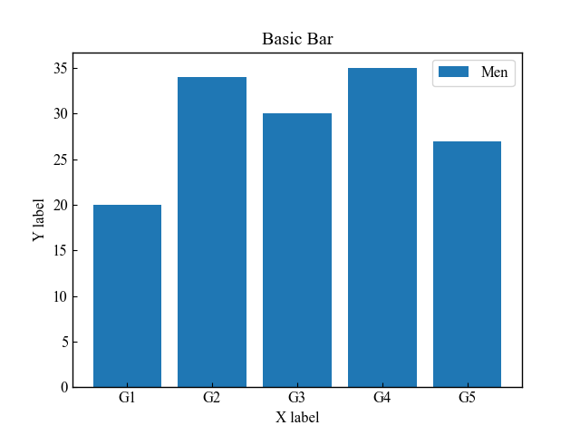
Horizontal bar chart (Axes.barh)
To plot horizontal bar charts in Matplotlib, use the Axes.barh function
Basically, it is used in the same way as the Axes.bar function to draw a vertical bar chart.
- Parameters
-
- y (float or array) : The y coordinates of the bars.
- width (float or array) : The width(s) of the bars.
- height (float or array) : The height(s) of the bars.
- left (float or array) : The x coordinates of the left side(s) of the bars.
- align (str):Alignment of the bars to the x coordinates: center or edge
- xerr, yerr (float or array) : Horizontal / Vertical errorbars. The values are +/- sizes relative to the data:
- color (color or list of color) : The colors of the bar faces.
- edgecolor (color or list of color) : The colors of the bar edges.
- linewidth (float) : Width of the bar edge(s). If 0, don’t draw edges.
- ecolor (color or list of color) : The line color of the errorbars.
- capsize (float):The length of the error bar caps in points.
- log (bool) : If True, set the y-axis to be log scale.
- Returns
-
- BarContainer : Container with all the bars and optionally errorbars.
- Official Documentation
# step3 Plot a horizontal bar chart
ax.barh(y, women_means, label='Women', tick_label=labels)

plt.show()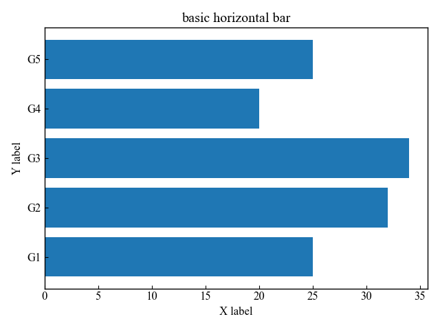
Set y-axis labels in ascending order (Axes.invert_yaxis)
The y-axis of the horizontal bar graph increases in value as you move up from the (0, 0) coordinate
However, when displaying with string labels, it is easier to see the opposite,
so Axes.invert_yaxis sets the y-axis labels in ascending order
# step3 Plot a horizontal bar chart
ax.barh(y, women_means, label='Women', tick_label=labels)
# Reverse the y-axis
ax.invert_yaxis()
plt.show()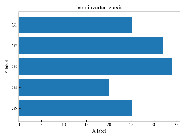
Produce right-to-left bar charts (Axes.invert_xaxis)
The y-axis of the horizontal bar graph has bars from the x=0 coordinate
Axes.invert_xaxis produces a bar chart from right to left, with x=0 on the right
# step3 Plot a horizontal bar chart
ax.barh(y, women_means, label='Women', tick_label=labels)
# Reverse the x-axis
ax.invert_xaxis()
plt.show()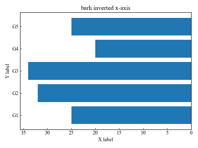
Stacked bar chart (bottom or left)
The Axes.bar and Axes.barh functions are also used to plot stacked bar charts
Define bottom as an argument and change the starting point of the second data and pile it up
The horizontal bar in the Axes.barh function defines left
# step3 Plot bar charts
ax.bar(x, men_means, label='Men')
ax.bar(x, women_means, label='Women', bottom=men_means, tick_label=labels)

plt.show()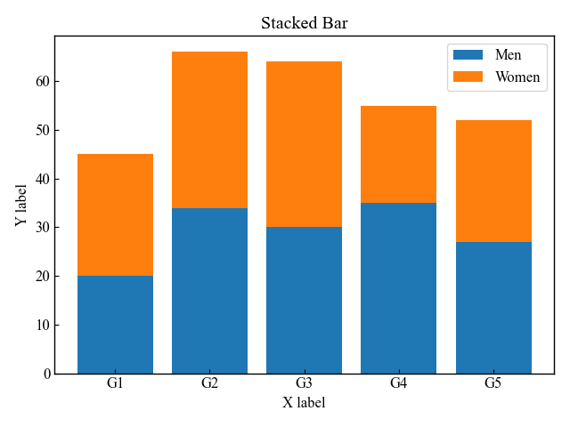
Grouped bar chart (width or height)
The Axes.bar and Axes.barh functions are also used to group bars
To shift each element, define width
In this article, the width of the bars is set to 0.4 and the x-coordinate is shifted by 0.2
The horizontal bar chart in the Axes.barh function defines height
width = 0.4

# step3 Plot bar charts
ax.bar(x - width/2, men_means, width, label='Men', tick_label=labels)
ax.bar(x + width/2, women_means, width, label='Women', tick_label=labels)

plt.show()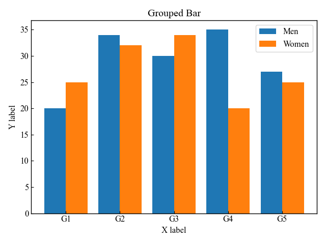
Labeled bar chart (Axes.bar_label)
To display a label for each element of a bar chart, use the Axes.bar_label function
- Parameters
-
- container (BarContainer) : Container with all the bars and optionally errorbars, likely returned form Axes.bar or Axes.barh
- labels (array) : A list of label texts, that should be displayed. If not given, the label texts will be the data values formatted with fmt.
- fmt (str) : An unnamed %-style or {}-style format string for the label or a function to call with the value as the first argument.
- label_type (str) : Label position at edge or center
- padding (float) : Distance of label from the end of the bar, in points.
- Returns
-
list of Text
- Official Documentation
-
matplotlib.axes.Axes.bar_label — Matplotlib 3.6.0 documentation
General bar chart with labels
This section explains how to label a single bar chart with the data as introduced in General bar chart
The procedure is to create a variable barcontainer with the Axes.bar function and define an array of labels in the variable.
# step3 Plot bar charts
# create a variable barcontainer
basic = ax.bar(x, men_means, width=0.4, label='Men', tick_label=labels)

# step4 Label bar charts
# define an array of labels
ax.bar_label(basic, labels=men_means)

plt.show()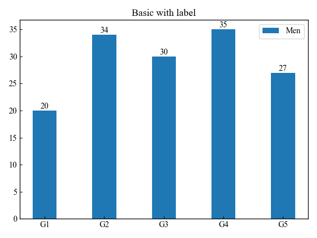
Labeled stacked bar chart (fmt)
This section describes how to label a Stacked bar chart with multiple data in a vertical line
Each variable created by the Axes.bar function should have a different name
Also, fmt is now displayed to one decimal place.
width = 0.4

# step3 Plot bar charts
stock1 = ax.bar(labels, men_means, width, label='Men', tick_label=labels)
stock2 = ax.bar(labels, women_means, width, bottom=men_means, label='Women', tick_label=labels)

# step4 Label bar charts
ax.bar_label(stock1, fmt='%.1f')
ax.bar_label(stock2, fmt='%.1f')

plt.show()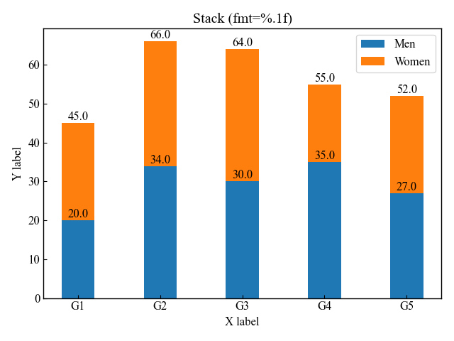
Labeled grouped bar chart (padding)
This section describes how to label a Grouped bar chart with multiple data side by side.
Each variable created by the Axes.bar function should have a different name
Also, the spacing of the Women label has been changed by specifying padding
width = 0.4

# step3 Plot bar charts
group1 = ax.bar(x - width/2, men_means, width, label='Men', tick_label=labels)
group2 = ax.bar(x + width/2, women_means, width, label='Women', tick_label=labels)

# step4 Label bar charts
ax.bar_label(group1, labels=men_means)
ax.bar_label(group2, labels=women_means, padding=10)

plt.show()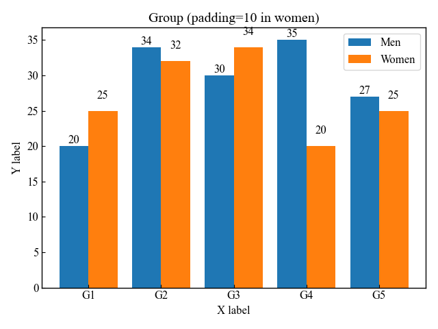
Labeled horizontal bar chart (fontsize)
This section describes how to label Horizontal bar charts
fontsize is set to 15 to make the labels a little larger.
The others have fontsize=12.
# step3 Plot horizontal bar charts
graph = ax.barh(y, women_means, height=0.6, label='Women')
# step4 Label bar charts
ax.bar_label(graph, labels=women_means, padding=5, fontsize=14)

plt.show()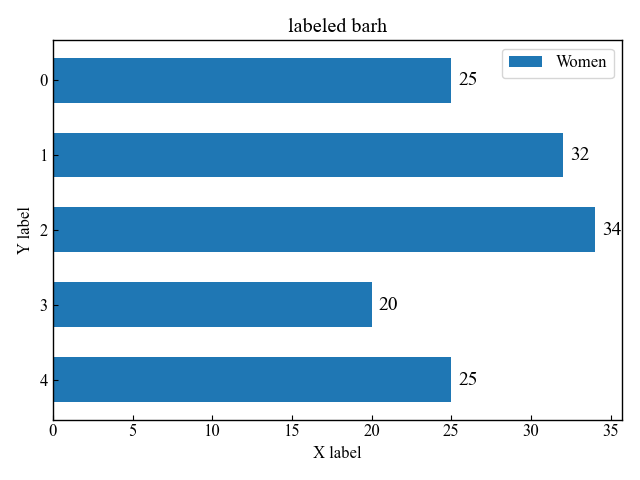
Error bars on bar charts (xerr, yerr)
The error bars of the bar chart define an array of numbers in xerr or yerr
xerr and yerr are the difference between x- and y-directions, and can be defined simultaneously.
Error bars in y direction (yerr)
The basic bar chart is an error bar in the y direction with yerr
# Array of error bars
men_std = [2, 3, 4, 1, 2]

# step3 Plot bar charts
ax.bar(x, men_means, width=0.4, label='Men', yerr=men_std, tick_label=labels)

plt.show()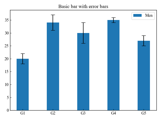
Label the error bars in the bar chart. (xerr)
This section describes how to label the error bars on a horizontal bar chart to indicate the magnitude of the error.
In the horizontal bar chart, xerr is the error bar in the x direction
# Array of error bars
women_std = [3, 5, 2, 3, 3]

# step3 Plot horizontal bar charts
graph = ax.barh(y, women_means, height=0.6, label='Women', xerr=women_std)
# step4 Label bar charts
ax.bar_label(graph, labels=['±%.1f' % e for e in women_std], padding=5, fontsize=14)

plt.show()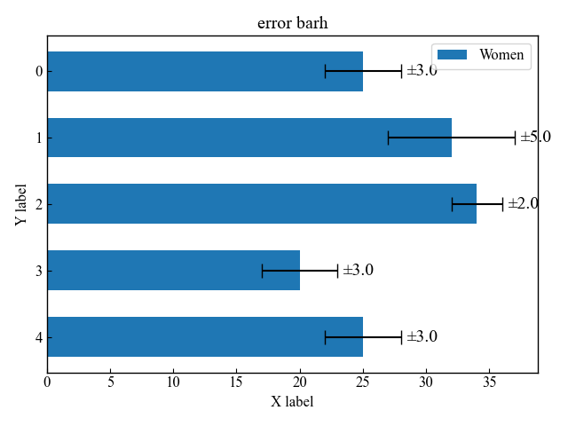
Change the color of the error bars (ecolor)
The color of the error bar is defined by ecolor argument to the Axes.bar function.
Please refer to the following for how to specify colors
# Array of error bars
men_std = [2, 3, 4, 1, 2]

# step3 Plot bar charts
ax.bar(x, men_means, width=0.4, yerr=men_std, ecolor='red', tick_label=labels)

plt.show()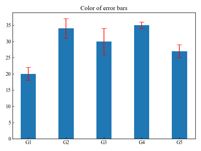
Change the size of the error bars (capsize)
The size of the error bar is defined by the capsize argument to the Axes.bar function
# Array of error bars
men_std = [2, 3, 4, 1, 2]
# step3 Plot bar charts
ax.bar(x, men_means, width=0.4, yerr=men_std, capsize=10, tick_label=labels)

plt.show()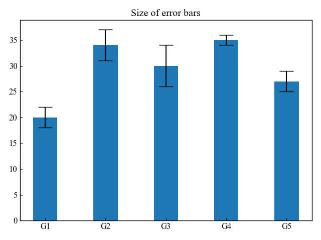
Bar chart color and other customizations
The Axes.bar function has many other arguments that can be customized.
The color of the bars can be specified in two ways: color, the color of the surface of the bars, and edgecolor, the color of the border.
The thickness of the bar chart border can also be adjusted by combining edgecolor and linewidth
Change the main color of the bar (color)
The color of the bar surface is defined by the color argument to the Axes.bar function
This time, the strings C0, C1, and C2 are specified for each bar
# step3 Plot a bar chart
ax.bar(x, men_means, tick_label=labels, color=['C'+str(i) for i in range(len(men_means))])

plt.show()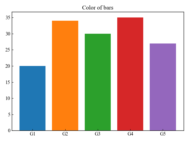
Change the color of the bar edge (edgecolor, linewidth)
The color of the bar’s edges is defined by the edgecolor argument to the Axes.bar function.
This time, the strings C0, C1, and C2 are specified for each bar
The thickness of the border is adjusted numerically by linewidth, but it can also be specified as an array
# step3 Plot a bar chart
ax.bar(x, men_means, tick_label=labels, color='white', edgecolor=['C'+str(i) for i in range(len(men_means))], linewidth=5)

plt.show()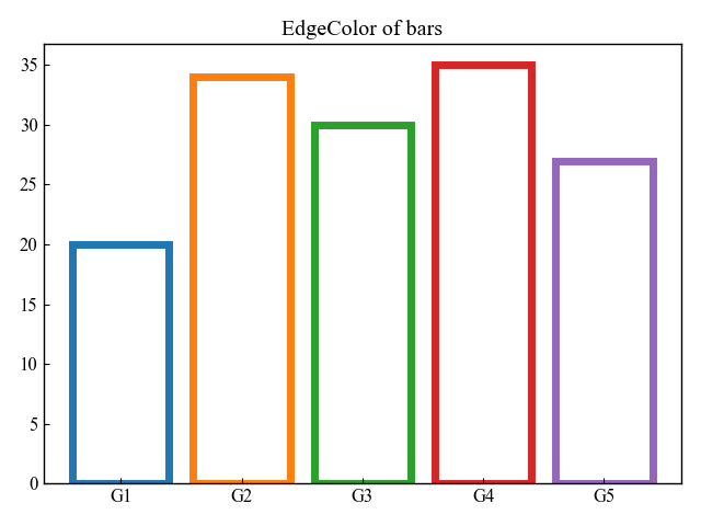
Align the x-coordinate bar (align)
Bars are drawn from the center of the specified x-coordinate
If align=edge, the x-coordinate is changed to the left end of the bar.
# step3 Plot a bar chart
ax.bar(x, men_means, align='edge', label='Men')

plt.show()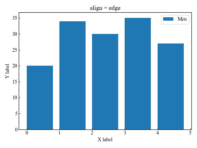
Bar chart on a logarithmic scale (log)
This section explains how to change the axis scale to logarithmic.
If log=True, the bar chart have a logarithmic axis.
# step3 Plot a bar chart
ax.bar(x, men_means, tick_label=labels, log=True)

plt.show()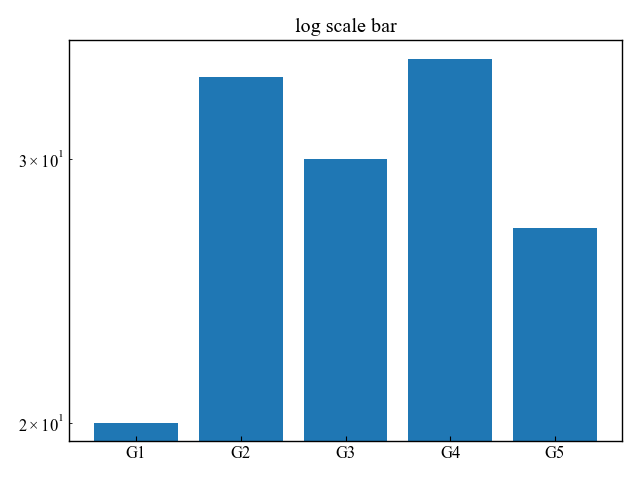
References
Axes.bar function
Axes.barh function
Axes.bar_label function
Stacked bar chart
Grouped bar chart
Horizontal bar chart
Bar Chart Labels
Comments
List of comments (1)
The easiest blog yet to understand for a beginner. Thanks!