Are you having trouble creating contour plots? To accurately represent the density and patterns in your data, you need to create contour plots the right way!
Matplotlib makes it easy to plot contour plots with little code!
This article explains how to plot contour plots in Matplotlib, from data to drawing.
It also explains about graphs corresponding to three dimensions.
3D data for contour plots
The contour plots data uses 3-dimensional data consisting of x- and y-coordinates plus z in the height direction.
Since the 3D data used in Matplotlib requires some ingenuity, this chapter describes how to process 3D data.
- x : Array with 240 elements in the interval from -3 to 3 in increments of 0.025
- y : Array with 160 elements with intervals from -2 to 2 in increments of 0.025
- X, Y, Z : 160-by-240 matrix with equally spaced values
The tabs below explain the 3D data codes and flowcharts.
import matplotlib.pyplot as plt
import numpy as np

# Functions for data preparation
def plt_data():
    delta = 0.025
    x = np.arange(-3.0, 3.0, delta)
    y = np.arange(-2.0, 2.0, delta)
    X, Y = np.meshgrid(x, y)
    Z1 = np.exp(-X**2 - Y**2)
    Z2 = np.exp(-(X - 1)**2 - (Y - 1)**2)
    Z = (Z1 - Z2) * 2

# Function Calls
X, Y, Z = plt_data()
# Shape of x: 240
# Shape of X: (160, 240)
# Shape of y: 160
# Shape of Y: (160, 240)
# Shape of Z: (160, 240)Simplest labeled contour plot (Axes.contour)
Contour plots in Matplotlib use the Axes.contour function
X and Y are the 160-by-240 matrix of coordinates processed by the numpy.meshgrid function, and Z is a 160-by-240 matrix of contour heights created from the grid data.
- Parameters
-
- X (array-like) : The coordinates of the values in Z. X and Y must both be 2D with the same shape as Z.
- Y (array-like) : X and Y must both be ordered monotonically.
- Z (array-like) : The height values over which the contour is drawn.
- levels (int or array-like):Determines the number and positions of the contour lines / regions.
- colors (str or array-like) : The colors of the levels
- alpha (float) : The alpha blending value, between 0 (transparent) and 1 (opaque).
- cmap (str or Colormap) : Color of contour area. Color changes according to data values
- **kwargs : There are many other arguments.
- Returns
- Official Documentation
The tabs below explain the codes and flowcharts.
import matplotlib.pyplot as plt
import numpy as np

# step1 Call 3D data
X, Y, Z = plt_data()
# step2 Create graph frames
fig, ax = plt.subplots()
# step3 Plot a contour plot
CS = ax.contour(X, Y, Z)
# step4 Show labels
ax.clabel(CS, inline=True)

ax.set_xlabel('X Label')
ax.set_ylabel('Y Label')
ax.set_title('Simple Contour')
plt.show()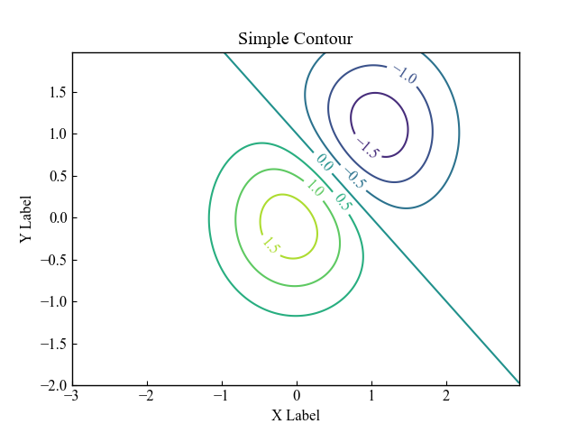
Fill color and add color bar (Axes.contourf)
In Matplotlib, the Axes.contourf function fills a contour plot with a color.
The basic function usage is the same as for Axes.contour.
- Parameters
-
- X (array-like) : The coordinates of the values in Z. X and Y must both be 2D with the same shape as Z.
- Y (array-like) : X and Y must both be ordered monotonically.
- Z (array-like) : The height values over which the contour is drawn.
- levels (int or array-like):Determines the number and positions of the contour lines / regions.
- colors (str or array-like) : The colors of the levels
- alpha (float) : The alpha blending value, between 0 (transparent) and 1 (opaque).
- cmap (str or Colormap) : Color of contour area. Color changes according to data values
- **kwargs : There are many other arguments.
- Returns
- Official Documentation
The tabs below explain the codes and flowcharts.
# step1 Call 3D data
X, Y, Z = plt_data()
# step2 Create graph frames
fig, ax = plt.subplots()
# step3 Plot a fill contour plot
CS = ax.contourf(X, Y, Z)
# step4 Set a color bar
fig.colorbar(CS)

plt.show()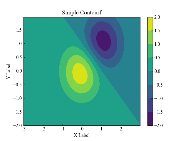
Customize the number and spacing of contour lines (levels)
To change the number of contour lines or spacing, specify levels=number.
If levels is specified as an int type, it is automatically chosen so that the number of contour lines is a good N+1 number or more.
# step3 Plot a contour plot
CS = ax.contour(X, Y, Z, levels=13)

plt.show()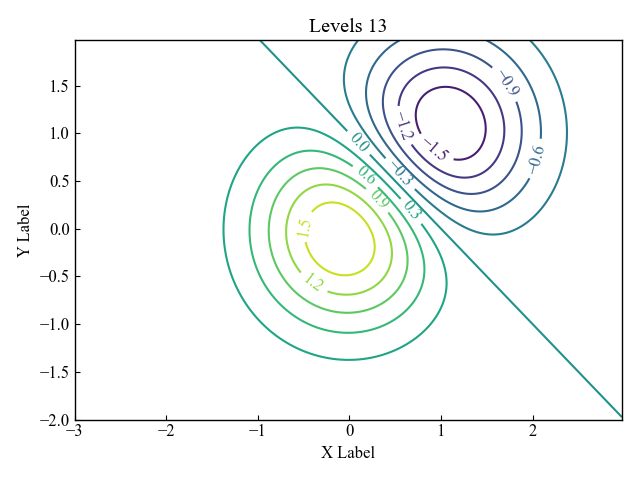
Specify color and transparency of contour lines (colors, alpha)
The colors of the contour lines are specified by colors=string (or array) and the transparency by alpha=number.
Colors can be specified as a string only, or as an array with each color specified as a string.
Contour lines color = string
The colors parameter of the Axes.contour function is a string such as red or black that changes color.
Click here to see the strings that can be specified.
# step3 Plot a contour plot
ax.contour(X, Y, Z, colors='red')

plt.show()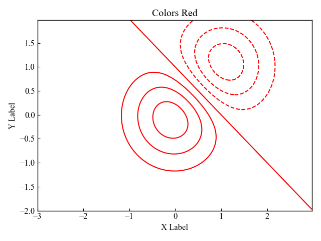
Contour lines color = Array
The colors parameter of the Axes.contour function is an array of string elements, such as red, black, etc., whose colors change.
# step3 Plot a contour plot
ax.contour(X, Y, Z, colors=['red', 'black'])

plt.show()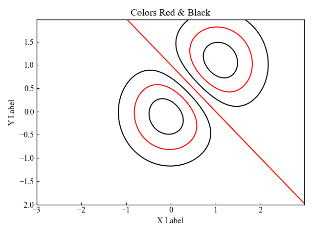
Contour lines color = color code (+ transparency)
Colors can also be specified by color code or RGB.
In this case, we specified a color code.
Click here to see how to specify
To change the transparency, enter a numerical value from 0 to 1 in alpha.
# step3 Plot a contour plot
ax.contour(X, Y, Z, colors='#0097a7', alpha=0.5)

plt.show()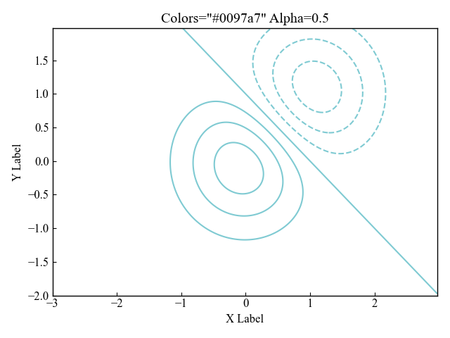
Specify contour lines from a color map (cmap)
The color map can change color according to the data values.
The function creates an RGBA array of the minimum to maximum values of the data.
- Parameters
-
- name (str) : Name of the colormap
- N (int) : Number of RGB quantization levels
- Returns
-
- Data is scalar : RGBA Array (tuple)
- Data is arrayed : RGBA Array (Data array + 4 rows)
- Official Documentation
Contour plots in black and white (Greys)
If cmap=Greys in the Axes.contour function parameter, the graph changes to black and white.
# step3 Plot a contour plot
CS = ax.contourf(X, Y, Z, cmap='Greys')
# step4 Set a color bar
fig.colorbar(CS, ax=ax)

plt.show()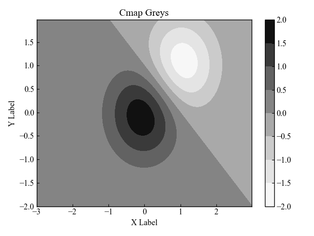
Contour plots in red and blue(bwr)
If cmap=bwr in the Axes.contour function parameter, the graph changes to read and blue.
# step3 Plot a contour plot
CS = ax.contourf(X, Y, Z, cmap='bwr')
# step4 Set a color bar
fig.colorbar(CS, ax=ax)

plt.show()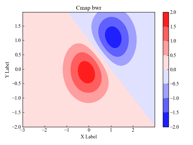
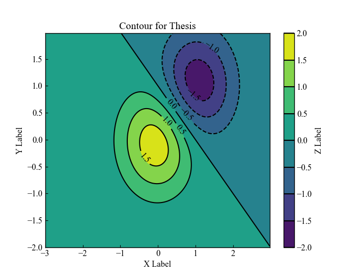
Contour plots for thesis (countour, contourf)
The most beautiful contour plots for papers are drawn by combining contour and contourf.
Fill in the contour lines, make the contour lines black, and display the color bars and labels.
# step1 Call 3D data
X, Y, Z = plt_data()
# step2 Create graph frames
fig, ax = plt.subplots()
# step3 Plot a contour plot
CS = ax.contour(X, Y, Z, colors='black')
# step4 Show labels on a contour plot
ax.clabel(CS, inline=True)

# step5 Fill contour lines
CSf = ax.contourf(X, Y, Z)

# step6 Set a color bar
cbar = fig.colorbar(CSf)
cbar.ax.set_ylabel('Z Label')
cbar.add_lines(CS)

plt.show()
3D contour plots (Axes3D.plot_surface)
Matplotlib can display contour lines as a 3-dimensional graph.
The 3D graph corresponding to the contour lines is a function of the surface graph Axes3D.plot_surface.
- Parameters
-
- X, Y, Z (array-like) : Coordinates of Z values, both X and Y are two-dimensional with the same shape as Z. X and Y must have equally spaced values.
- vmin, vmax (float) : Bounds for the normalization.
- **kwargs : There are many other arguments.
- Returns
- Official Documentation
# step2 Create graph frames
fig, ax = plt.subplots(subplot_kw={'projection': '3d'})
# step3 Plot a 3D contour plot
SF = ax.plot_surface(X, Y, Z, cmap='viridis')

# step4 Set a color bar
cbar = fig.colorbar(SF, aspect=8)
cbar.ax.set_ylabel('Z Label')

plt.show()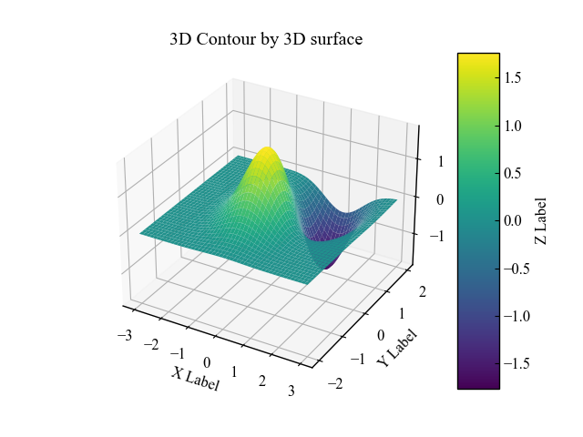
References
Official documentation of Axes.contour
Official documentation of Axes.contourf
Official documentation of Simple Contour Demo
Official documentation of Filled Contour Demo
Official documentation of plot_surface
Comments