When plotting a graph in Python’s Matplotlib, have you ever wanted to fill in areas of the graph?
This is often the case when you want to show a range or an error range.
This is also the case when you want to plot an area graph, which is similar to a line chart.
This article explains how to use the Axes.fill_between and Axes.fill_betweenx functions to plot a graph with filled areas in Matplotlib.
Fill an area in a line chart (Axes.fill_between)
Axes.fill_between function fills the area between two horizontal curves.
- Parameters
-
- x (aray) : The x coordinates of the nodes defining the curves.
- y1 (array or scalar) : The y coordinates of the nodes defining the first curve.
- y2 (array or scalar) : The y coordinates of the nodes defining the second curve.
- where (array) : Define where to exclude some horizontal regions from being filled.
- interpolate (True or False) : This option is only relevant if where is used and the two curves are crossing each other.
- step (‘pre’, ‘post’, ‘mid’) : Define step if the filling should be a step function
- alpha (float) : Define transparency in the range of 0~1
- color (color) : Define the color to fill
- Returns
- Official Documentation
Let me first explain the data and the line chart we will be using.
import matplotlib.pyplot as plt
import numpy as np

# step1 Create data
x = np.linspace(0, 10, 100)
y1 = 2 * np.sin(2 * x)
y2 = 4 + 2 * np.sin(2 * x)
# step2 Create graph frames
fig, ax = plt.subplots()
# step3 Plot a line chart
ax.plot(x, y1, label=r'$y1 = 2sin(2x)$')
ax.plot(x, y2, label=r'$y2 = y1+4$')

ax.set_title(r'plot y1, y2')
ax.set_xlabel('X label')
ax.set_ylabel('Y label')
ax.set_ylim(-3, 8)
ax.legend()

plt.show()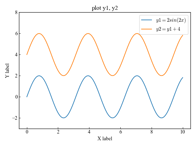
Fill line chart and specified range of values
The Axes.fill_between function can be used in the same way as the Axes.plot function is used to draw a line chart
If only x and y are specified, the area between y and 0 will be filled
# step3 Plot a filled graph for the range y1 to 0
ax.fill_between(x, y1, label=r'$y1 = 2sin(2x)$')

plt.show()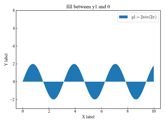
Next, fill in an arbitrary range by specifying a numerical value for the argument following y
Fill between y and 1
# step3 Plot a filled graph for the range y1 to 1
ax.fill_between(x, y1, 1, label=r'$y1 = 2sin(2x)$')

plt.show()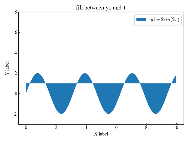
Fill in between two line charts
If the arguments of the Axes.fill_between function are specified in the order x, y1, y2, the interval between the line chart will be filled
# step3 Plot a filled graph for the range y1 to y2
ax.fill_between(x, y1, y2, label=r'$y1 = 2sin(2x), y2 = y1+4$')

plt.show()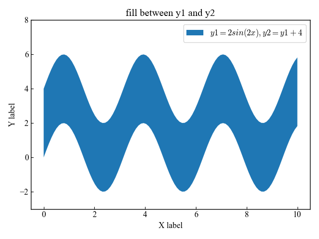
Fill in the error range of a line chart (alpha)
To fill the error range of a line chart, the third argument of the Axes.fill_between function should be an array
You can also specify the transparency by entering alpha between 0 and 1.
The following tabs explain with codes and flowcharts
# step1 Create data
x = np.linspace(0, 10, 11)
y = [3.9, 4.4, 10.8, 10.3, 11.2, 13.1, 14.1,  9.9, 13.9, 15.1, 12.5]

# step2 Estimate Prediction Lines and Error Ranges
a, b = np.polyfit(x, y, deg=1)
y_est = a * x + b
y_err = x.std() * np.sqrt(1/len(x) +
                        (x - x.mean())**2 / np.sum((x - x.mean())**2))

# step3 Create graph frames
fig, ax = plt.subplots()
# step4 Plot a graph
# Prediction Lines
ax.plot(x, y_est)
# Confidence intervals for the forecast line
ax.fill_between(x, y_est - y_err, y_est + y_err, alpha=0.2)
# Actual data
ax.scatter(x, y)

ax.set_title(r'Confidence bands')
plt.show()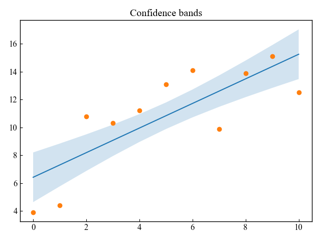
Specify the area to be filled by condition (where, facecolor)
By specifying the condition using the argument “where”, you can specify more precisely the area to be filled.
Let me first explain the data and the line graph we will be using.
# step1 Create data
x = np.linspace(0, 10, 100)
y1 = 2 * np.sin(2 * x)
y2 = 2 * np.cos(2 * x)

# step2 Create graph frames
fig, ax = plt.subplots()

# step3 Plot graphs
ax.plot(x, y1)
ax.plot(x, y2)

plt.show()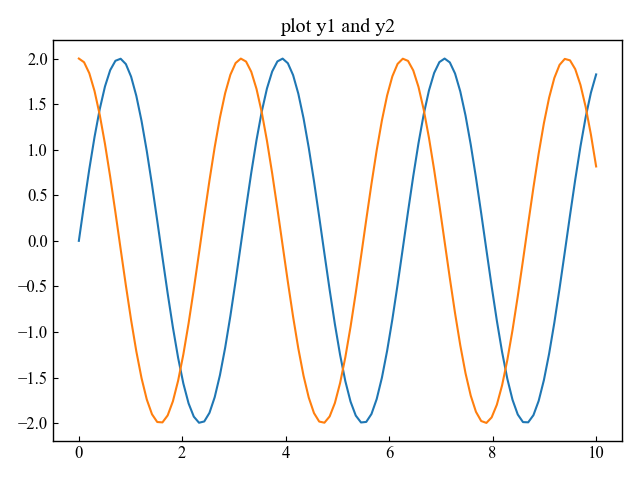
Fill only when the value of y is large (where)
As you can see in the above graph, y1 and y2 are interchanged in size when compared
So I filled only when y2 is greater than y1
# step3 Plot graphs
# Fill if y2 value is greater than y1
ax.fill_between(x, y1, y2, where=y2 >= y1)

plt.show()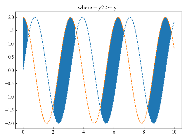
Next, I did a fill only when y2 was less than y1
# step3 Plot graphs
# Fill if y2 value is less than y1
ax.fill_between(x, y1, y2, where=y2 <= y1)

plt.show()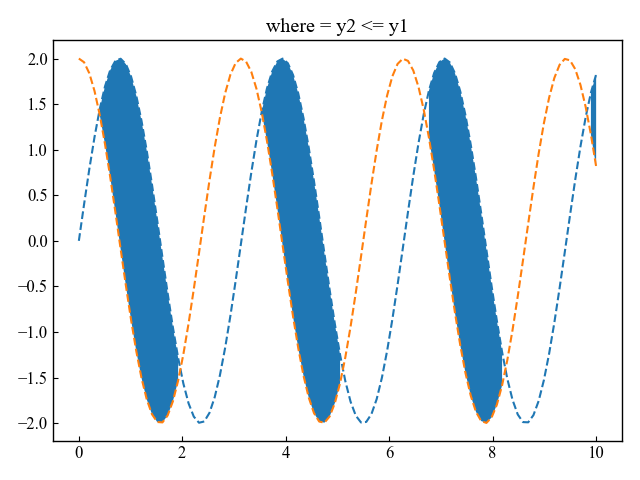
Change the fill color for each condition. (color)
You can change the color for each condition by specifying where and facecolor as two arguments to the Axes.fill_between function
Change the color each time y1 and y2 are interchanged.
# step3 Plot graphs
# Specify the color to fill with facecolor
ax.fill_between(x, y1, y2, where=y2 >= y1, color='C0')
ax.fill_between(x, y1, y2, where=y2 <= y1, color='C1')

plt.show()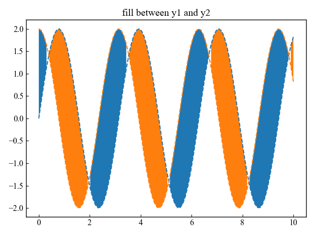
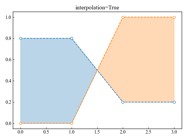
Expand the area to be filled to the intersection (interpolation)
x sequences containing intersections may not fill well
If interpolate is set to True, the actual intersection is calculated and the fill area is expanded to the intersection
- Marked line graph of (x, y1) and (x, y2)
- Filled graph when y2 value is greater than y1
- Filled graph when y2 value is less than y1
The following tabs explain with codes and flowcharts
# step1 Create data
x = np.array([0, 1, 2, 3])
y1 = np.array([0.8, 0.8, 0.2, 0.2])
y2 = np.array([0, 0, 1, 1])
# step2 Create graph frames
fig, ax = plt.subplots()
# step3 Plot graphs
ax.plot(x, y1, 'o--')
ax.plot(x, y2, 'o--')
ax.fill_between(x, y1, y2, where=(y1 > y2), color='C0', alpha=0.3,
                interpolate=True)
ax.fill_between(x, y1, y2, where=(y1 <= y2), color='C1', alpha=0.3,
                interpolate=True)

ax.set_title('interpolation=True')
plt.show()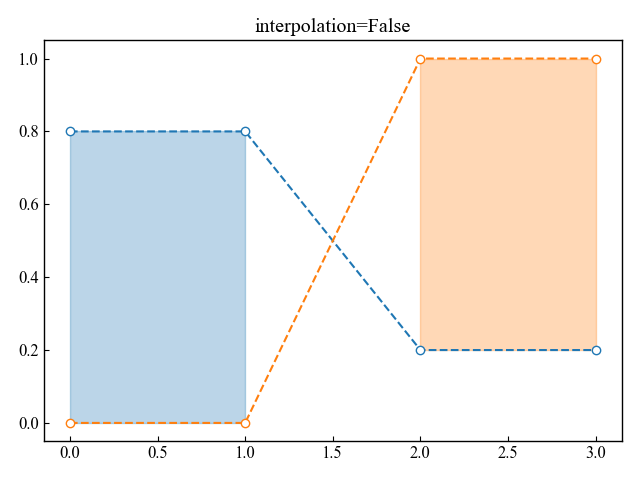
Fill line chart area in x-direction (Axes.fill_betweenx)
The function Axes.fill_betweenx can fill in the x direction
- Parameters
-
- y (array) : The y coordinates of the nodes defining the curves.
- x1 (array or scalar) : The x coordinates of the nodes defining the first curve.
- x2 (array or scalar) : The x coordinates of the nodes defining the second curve.
- where (array) : Define where to exclude some vertical regions from being filled.
- interpolate (True or False) : This option is only relevant if where is used and the two curves are crossing each other.
- step (‘pre’, ‘post’, ‘mid’) : Define step if the filling should be a step function
- alpha (float) : Define transparency in the range of 0~1
- color (color) : Define the color to fill
- Returns
- Official Documentation
# step1 Create data
y = np.linspace(0, 10, 100)
x1 = 2 * np.sin(2 * y)
x2 = 4 + 2 * np.sin(2 * y)

# step2 Create graph frames
fig, ax = plt.subplots()

# step3 Plot graphs
ax.plot(x1, y, '--', label=r'$x1 = 2sin(2y)$')
ax.plot(x2, y, '--', label=r'$x1 = x2+4$')

ax.set_title(r'plot x1 and x2')
ax.set_xlim(-3, 10)
ax.legend()
plt.show()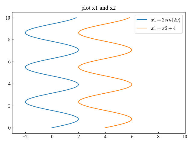
Fill in the x-direction between the x1 and x2 line graphs above
# step3 Plot graphs
ax.fill_betweenx(y, x1, x2, alpha=0.5)

plt.show()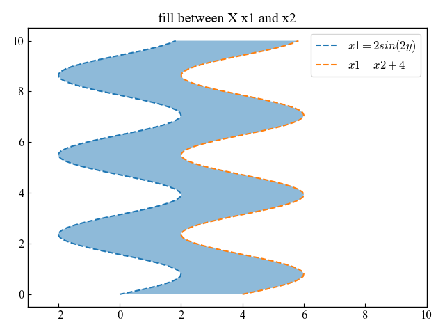
References
Fill in line chart
Axes.fill_between function
Fill line chart in x direction
Axes.fill_betweenx function
Comments