Do you feel unsure how to merge multiple Y-axes into a single graph to see the complex relationships in your data? You may also not know how to add a legend to a graph.
In this article, I will explain in simple terms how to add multiple Y-axes to a graph in Matplotlib using twinx!
In addition, the plot and scatter functions are explained in detail, as they each have different ways of adding a legend!
After reading this, you will be able to master Matplotlib’s twinx and effectively use multiple Y-axes in a single graph. You will also understand how to add a legend and improve your clear visualization and data analysis skills!
Line chart with multiple y-axes
In Matplotlib, the Axes.twinx function increases the number of axes
To add a legend, use an object created with the plot function as the handles argument of legend.
- Returns
-
Axes
- Official Documentation
With two y-axes
Add one y-axis with the Axes.twinx function and draw two line graphs
The following tabs explain the code and flowchart
import matplotlib.pyplot as plt
import numpy as np

# step1 Create graph frames
fig, ax = plt.subplots()

# step2 Create y-axis
twin1 = ax.twinx()

# step3 Plot line charts
p1, = ax.plot([0, 1, 2], [0, 1, 2], 'C0', label='Y1')
p2, = twin1.plot([0, 1, 2], [0, 3, 2], 'C1', label='Y2')

ax.set_xlabel('X label')
ax.set_ylabel('Y1')
twin1.set_ylabel('Y2')
ax.set_title('line graph with 2 y-axes')

# step4 Add a legend
ax.legend(handles=[p1, p2])

plt.show()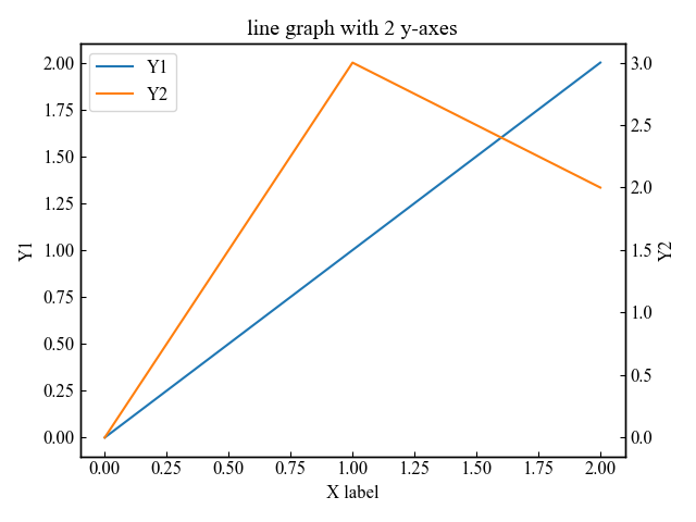
With three y-axes
Add two y-axes with the Axes.twinx function and draw three line graphs
The right side of the graph has been left open by 0.25 and the position of the third axis has been moved to the right by 0.2
# step1 Create graph frames
fig, ax = plt.subplots()
fig.subplots_adjust(right=0.75)

# step2 Create y-axis
twin1 = ax.twinx()
twin2 = ax.twinx()
# Move twin2 to the right
twin2.spines['right'].set_position(('axes', 1.2))

# step3 Plot line charts
p1, = ax.plot([0, 1, 2], [0, 1, 2], 'C0', label='Y1')
p2, = twin1.plot([0, 1, 2], [0, 3, 2], 'C1', label='Y2')
p3, = twin2.plot([0, 1, 2], [50, 30, 15], 'C2', label='Y3')

# step4 Add a legend
ax.legend(handles=[p1, p2, p3], loc='center left')

plt.show()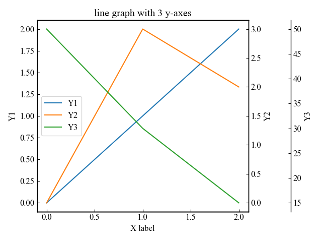
Scatter plots with multiple y-axes
The Axes.twinx function also increases the number of axes in a scatter plot.
With two y-axes
Add one y-axis with the Axes.twinx function and draw two scatter plots
The following tabs explain the code and flowchart
# step1 Create graph frames
fig, ax = plt.subplots()

# step2 Create y-axis
twin1 = ax.twinx()

# step3 Plot scatter plots
p1 = ax.scatter([0, 0.4, 0.8, 1, 1.3, 1.8, 2], [0, 8, 2, 1, 21, 14, 22], c='C0', label='Y1')
p2 = twin1.scatter([0, 0.7, 0.9, 1, 1.2, 1.5, 2], [0, 34, 23, 23, 12, 8, 16], c='C1', label='Y2')

ax.set_xlabel('X label')
ax.set_ylabel('Y1')
twin1.set_ylabel('Y2')
ax.set_title('scatter graph with 2 y-axes')

# step4 Add a legend
ax.legend(handles=[p1, p2])

plt.show()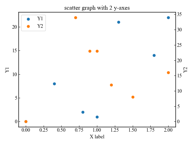
With three y-axes
Add two y-axes with the Axes.twinx function and draw three scatter plots
The right side of the graph has been left open by 0.25 and the position of the third axis has been moved to the right by 0.2
# step1 Create graph frames
fig, ax = plt.subplots()
fig.subplots_adjust(right=0.75)

# step2 Create y-axis
twin1 = ax.twinx()
twin2 = ax.twinx()
# Move twin2 to the right
twin2.spines['right'].set_position(('axes', 1.2))

# step3 Plot scatter plots
p1 = ax.scatter([0, 0.4, 0.8, 1, 1.3, 1.8, 2], [0, 8, 2, 1, 21, 14, 22], c='C0', label='Y1')
p2 = twin1.scatter([0, 0.7, 0.9, 1, 1.2, 1.5, 2], [0, 34, 23, 23, 12, 8, 16], c='C1', label='Y2')
p3 = twin2.scatter([0, 0.6, 0.8, 1, 1.4, 1.8, 2], [22, 50, 23, 24, 95, 30, 15], c='C2', label='Y3')

# step4 Add a legend
ax.legend(handles=[p1, p2, p3])

plt.show()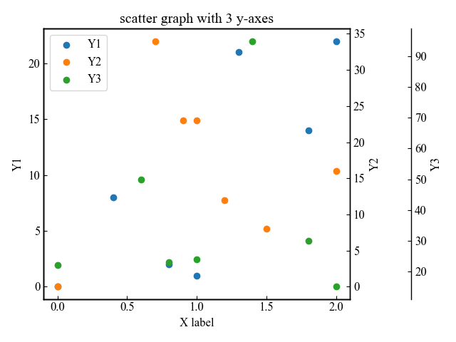
Define colors for the three y-axes and axis labels
This section explains how to define the color of each axis created with Axes.twinx function to create a more descriptive graph.
The changes to be made include the three y-axes, the y-axis labels, and the line chart.
# Add under ax.legend(handles=[p1, p2, p3]
# Color of axis label
ax.yaxis.label.set_color(p1.get_color())
twin1.yaxis.label.set_color(p2.get_color())
twin2.yaxis.label.set_color(p3.get_color())
# Color of axis values
ax.tick_params(axis='y', colors=p1.get_color())
twin1.tick_params(axis='y', colors=p2.get_color())
twin2.tick_params(axis='y', colors=p3.get_color())

plt.show()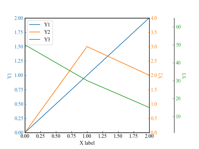
References
Graphs with multiple axes
Comments