When plotting angle-dependent data on a graph, have you left the x-axis horizontal?
To make the angle-by-angle data easier to understand, make the axes of the graph circular.
This article details how to plot a graph of polar coordinates, making full use of Matplotlib’s polar and PolarAxes. Effectively visualize your polar data and deepen your analysis
Gain a visual understanding of polar coordinate data in your projects and research Clearly see patterns and relationships between angles and distances, and identify trends in your data
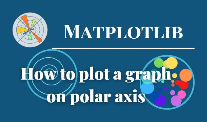
Bar graph on polar axis (plt.subplot)
This section explains how to combine plt.subplot‘s projections.polar and Axes.bar to plot a bar chart on the polar axis.
Color changes with size
The color of the graph changes according to the size of the value of each element in the bar chart.
The following tabs explain the code and flowchart
import matplotlib.pyplot as plt
import numpy as np

# step1 Fix random numbers for reproducibility
np.random.seed(19680801)

# step2 Calculate pie slices
N = 20
theta = np.linspace(0.0, 2 * np.pi, N, endpoint=False)
radii = 10 * np.random.rand(N)
width = np.pi / 4 * np.random.rand(N)
# Color changes depending on the size of the element
# colors = plt.cm.viridis(radii / 10.)

# step3 Create graph frames
ax = plt.subplot(projection='polar')

# step4 Plot a bar graph
ax.bar(theta, radii, width=width, bottom=0.0, color=colors, alpha=0.5)

plt.show()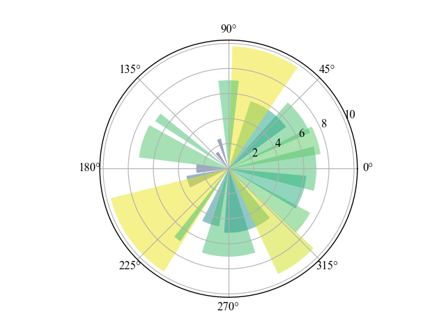
Color changes with angle (position)
The graph changes color according to the angle (position) of each element in the bar chart.
Only colors are changed.
- Angle
-
- radii / 10.→theta / (2 * np.pi)
- Colormap
-
- plt.cm.viridis→plt.cm.hsv
# Color changes depending on the angle (position) of the element
colors = plt.cm.hsv(theta / (2 * np.pi))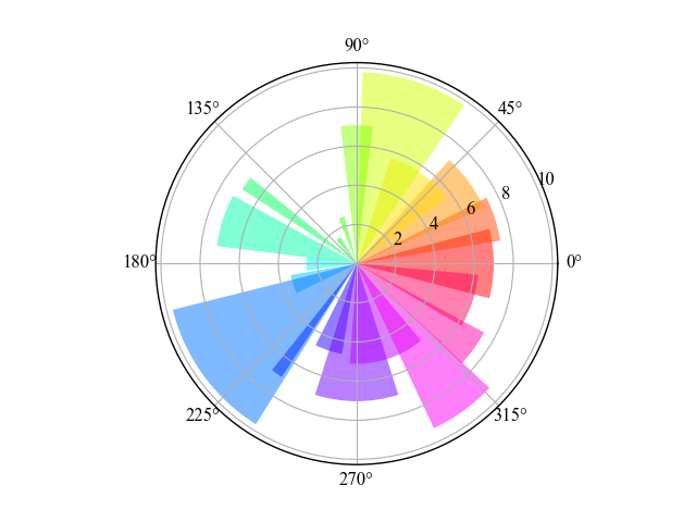
Scatter plots on polar axis (plt.subplots)
This section explains how to combine plt.subplots‘ projections.polar and Axes.scatter to plot scatter plots on the polar axis.
Color changes with angle
This scatter plot changes color according to the angle of each element.
Colormap used hsv
The following tabs explain the code and flowchart
# step2 Calculate area and color
N = 150
r = 2 * np.random.rand(N)
theta = 2 * np.pi * np.random.rand(N)
area = 200 * r**2
colors = theta

# step3 Create graph frames
fig, ax = plt.subplots(subplot_kw={'projection': 'polar'})
# step4 Plot a scatter plot
ax.scatter(theta, r, c=colors, s=area, cmap='hsv', alpha=0.75)

plt.show()
Color changes with size with colorbar (colorbar)
This scatter plot changes color according to the size of each element
Colormap uses viridis, and the color bar is displayed.
- Parameters
- Returns
- Official Documentation
# step2 Calculate area and color
colors = area

# step3 Create graph frames
fig, ax = plt.subplots(subplot_kw={'projection': 'polar'})
# step4 Plot a scatter plot
SC = ax.scatter(theta, r, c=colors, s=area, cmap='viridis', alpha=0.75)

# step5 Set a color bar
cbar = fig.colorbar(SC, aspect=10)
cbar.ax.set_ylabel('Z Label')

plt.show()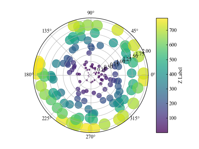
Line graph on polar axis (plt.subplots)
This section explains how to combine plt.subplots projections.polar and Axes.plot to plot a line chart on the polar axis.
Line graphs and scales (rticks, rlabel_position)
This section explains how to customize the settings of the polar axes.
Scale, maximum scale, label positioning, and grid display position are done.
The following tabs explain the code and flowchart
# step1 Create data
r = np.arange(0, 2, 0.01)
theta = 2 * np.pi * r

# step2 Create graph frames
fig, ax = plt.subplots(subplot_kw={'projection': 'polar'})
# step3 Plot a line graph
ax.plot(theta, r)
ax.set_rmax(2)
ax.set_rticks([0.5, 1, 1.5, 2])  # Less radial ticks
ax.set_rlabel_position(-22.5)  # Move radial labels away from plotted line
ax.grid(True)

ax.set_title("A line plot on a polar axis", va='bottom')
plt.show()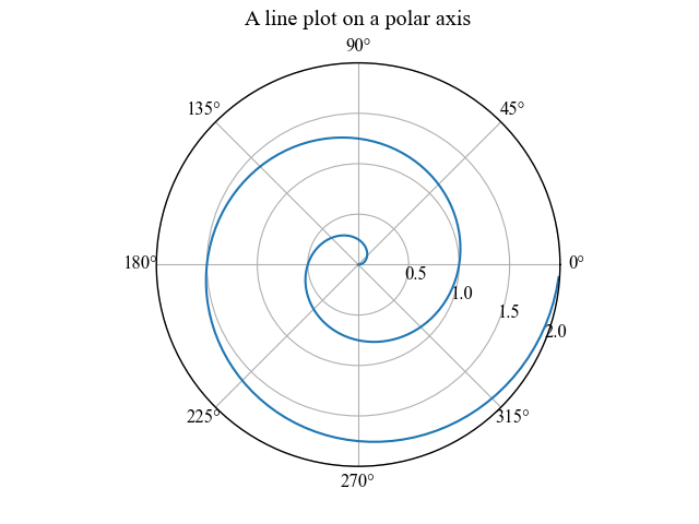
Line graphs and legends (legend)
This section explains how to add a legend when displaying a line chart with polar axes
Legend is positioned by combining loc and bbox_to_anchor
The following tabs explain the code and flowchart
# step3 Plot a a line graph
ax.plot(theta, r, label='Sample 1')
ax.plot(0.5 * theta, r, ls='--', label='Sample 2')

# step4 Set the legend for polar axis
# In the snippet, the lower left corner of the legend is placed just outside the polar axis,
# at an angle of 67.5 degrees in polar coordinates
angle = np.deg2rad(67.5)
# Move the legend slightly away from the center of the axis
# to avoid overlap between the legend and the axis
ax.legend(loc="lower left",
        bbox_to_anchor=(.5 + np.cos(angle)/2, .5 + np.sin(angle)/2))

ax.set_title("Line plots with a legend on a polar axis", va='bottom', pad=50)

plt.tight_layout()
plt.show()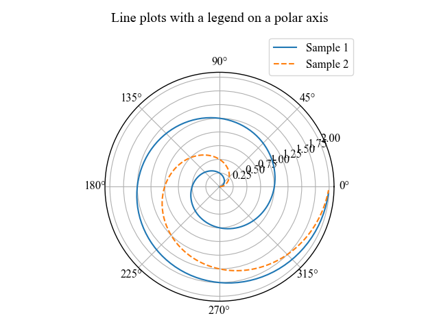
References
Bar chart on polar axis
Line chart on polar axis
Scatter plot on polar axis
Legend for graphs with polar axis
Official Documentation of Colorbar
Comments