Do you want to visualize the relationships and distribution of your data by creating scatter and bubble charts, but you are not sure how to achieve this?
Maybe you want to know how to create graphs that accurately represent patterns and correlations in your data.
This article explains in detail how to use Matplotlib’s scatter function to create basic scatter plots, how to customize markers, and how to display bubble charts.
It will help you to visually capture the relationship between data points and the size of elements to improve the accuracy of your data analysis.
Basic scatter plots (Axes.scatter)
To display scatter plots in Matplotlib, use the Axes.scatter function
Define an array with the same number of elements for x and y, respectively
- Parameters
-
- x, y (float or array) : The data positions.
- s (float or array) : The marker size in points**2
- c (array) : The marker colors.
- marker (MarkerStyle) : The marker style.
- cmap (Colormap) : The Colormap instance or registered colormap name used to map scalar data to colors.
- vmax, vmin (float) : The normalization method used to scale scalar data to the [0, 1] range before mapping to colors using cmap
- alpha (float) : The alpha blending value
- linewidth (float or array) : The linewidth of the marker edges.
- edgecolor (color) : The edge color of the marker.
- Returns
- Official Documentation
The following tabs explain the code and flowchart
import matplotlib.pyplot as plt
import numpy as np

# step1 Fixed random numbers to be generated
np.random.seed(19680801)
# step2 Create data
x = np.random.randn(100)
y = np.random.randn(100)
# step3 Create graph frames
fig, ax = plt.subplots()
# step4 Plot a scatter plot
ax.scatter(x, y)

ax.set_ylabel('Y label')
ax.set_xlabel('X label')
ax.legend()
ax.set_title('Simple scatter')

plt.show()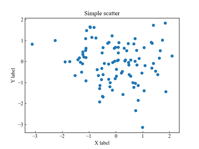
Marker type and size (marker, s)
Scatterplot markers can be defined in type and size
Type of markers (marker)
The type of marker for scatter plots can be changed with the marker argument
There are two main types: with fill and without fill.
# step4 Plot a scatter plot
ax.scatter(x, y, marker='*')
Size of markers (s)
The size of the marker is entered as the argument s=(number)
# step4 Plot a scatter plot
ax.scatter(x, y, s=100)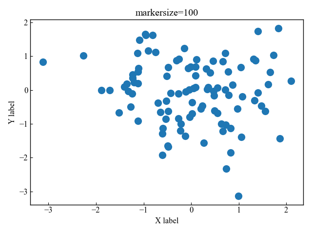
If you want the marker size to vary with coordinates, use s=(formula)
# step4 Plot a scatter plot
ax.scatter(x, y, s=y*100)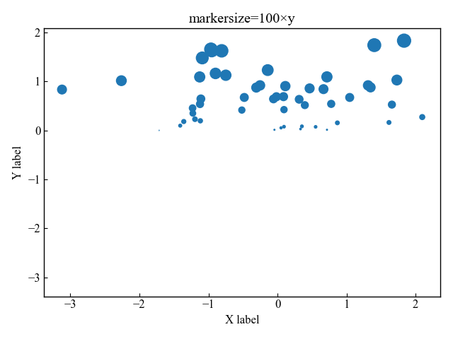
Marker color, transparency and frame (c, alpha, edgecolor, linewidth)
The marker color options include main color, transparency, border color, and border thickness
Main color (c)
The color of the marker is defined by the argument c
# step4 Plot a scatter plot
ax.scatter(x, y, c='C1')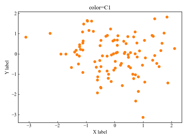
Transparency (alpha)
The transparency of the marker is defined by alpha=(0~1 number)
# step4 Plot a scatter plot
ax.scatter(x, y, alpha=0.5)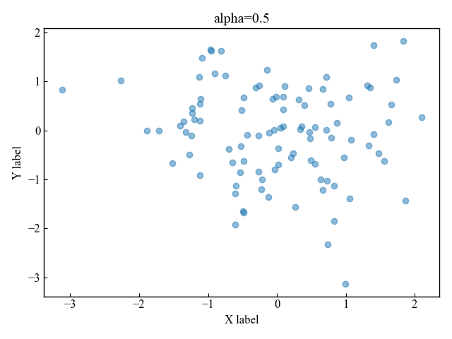
Color and Thickness of edges (edgecolor, linewidth)
The color and thickness of edges are defined by edgecolor and linewidth, respectively
# step4 Plot a scatter plot
ax.scatter(x, y, edgecolor='red', linewidth=3)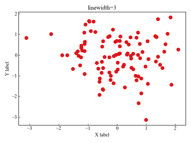
Bubble charts (cmap, vmax, vmin, colorbar)
Bubble chart representing 3D data with x, y coordinates plus z size is drawn with the Axes.scatter function
When displayed on a scatterplot, the size of z is identified by the size and color of the marker
The color map can change color according to the data values.
The function creates an RGBA array of the minimum to maximum values of the data.
- Parameters
-
- name (str) : Name of the colormap
- N (int) : Number of RGB quantization levels
- Returns
-
- Data is scalar : RGBA Array (tuple)
- Data is arrayed : RGBA Array (Data array + 4 rows)
- Official Documentation
Color change with colormap (cmap)
To change the color numerically, define a new array called z.
Then set c=z and add cmap.
# step2 Create data
x = np.random.randn(100)
y = np.random.randn(100)
z = np.random.randn(100)

# step3 Create graph frames
fig, ax = plt.subplots()

# step4 Plot a scatter plot
ax.scatter(x, y, s=z*100, c=z, cmap='viridis')

plt.show()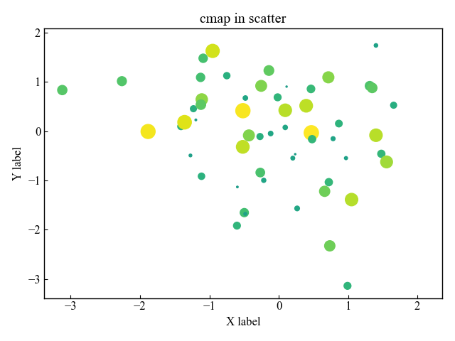
Add a colorbar (figure.colorbar)
Add a color bar (figure.colorbar) to show the relationship between color and Z size.
# step4 Plot a scatter plot
CS = ax.scatter(x, y, s=z*100, c=z, cmap='viridis')
# step5 Add a colorbar
fig.colorbar(CS, ax=ax)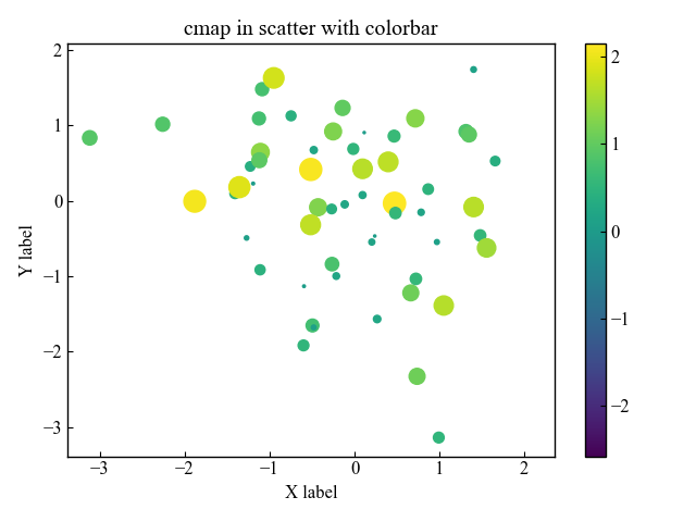
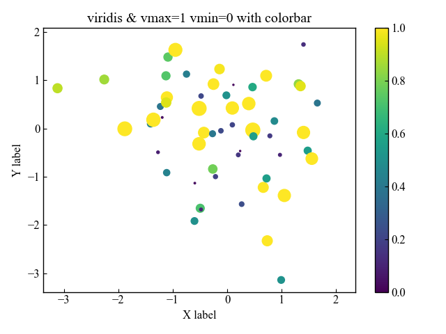
Colormap upper and lower limits (vmax, vmin)
The upper and lower limits of the colormap are defined by the values vmax and vmin
The colorbar on the graph shows that the values have changed.
# step4 Plot a scatter plot
CS = ax.scatter(x, y, s=z*100, c=z, cmap='viridis', vmax=1, vmin=0)
# step5 Add a colorbar
fig.colorbar(CS, ax=ax)
3D scatter plots (projection)
A 3D scatter plot is defined as subplot_kw={‘projection’:’3d’}
Enter the x, y, z arrays into the created ax
import matplotlib.pyplot as plt
import numpy as np

# step1 Fixed random numbers to be generated
np.random.seed(19680801)
# step2 Create data
x = np.random.randn(100)
y = np.random.randn(100)
z = np.random.randn(100)
# step3 Create graph frames
fig, ax = plt.subplots(subplot_kw={'projection':'3d'})
# step4 Plot a scatter plot
CS = ax.scatter(x, y, z, s=z*100, c=z)
# step5 Add a colorbar
fig.colorbar(CS, ax=ax)

plt.show()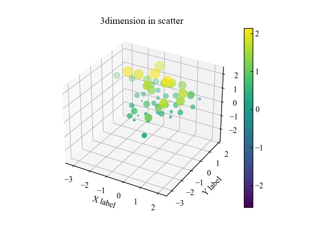
References
Axes.scatter function
Type of marker
scatter plots with a color bar
3D scatter plots
Comments