Pie charts are often used to show proportions of data.
This article explains how to plot a pie chart in Matplotlib.
In addition, detailed instructions are provided on how to customize the pie chart legend, labels, percentages, changing element coordinates, colors, color maps, thickness, text, and more.
Please refer to the following article regarding donut charts
Options for a pie chart
In Matplotlib, a pie chart is plotted with the Axes.pie function.
You can customize the legend, labels, percentages, etc. by entering arguments to the Axes.pie function.
- Parameters
-
- x (1D array-like) : The wedge sizes.
- explode (array-like) : If not None, is a
len(x)array which specifies the fraction of the radius with which to offset each wedge. - labels (list) : A sequence of strings providing the labels for each wedge
- colors (color or array-like) : A sequence of colors for the pie chart.
- autopct (str) : Labels as numerical percentages
- pctdistance (float) : The relative distance along the radius at which the text generated by autopct is drawn.
- shadow (bool) : Draw a shadow on a graph
- labeldistance (float) : The relative distance along the radius at which the labels are drawn.
- counterclock (bool) : Specify fractions direction, clockwise or counterclockwise.
- startangle (float) : The angle by which the start of the pie is rotated, counterclockwise from the x-axis.
- radius (float) : The radius of the pie.
- wedgeprops (dict) : Dict of arguments passed to each
patches.Wedgeof the pie. - textprops (dict) : Dict of arguments to pass to the text objects.
- center ((float, float)) : The coordinates of the center of the chart.
- frame (bool) : Plot Axes frame with the chart if true.
- rotatelabels (bool) : Rotate each label to the angle of the corresponding slice if true.
- normalize (bool) : Normalization of graph values
- Returns
-
- patches (lists) : A sequence of matplotlib.patches.Wedge instances
- texts (list) : A list of the label Text instances.
- autotexts (list) : A list of Text instances for the numeric labels. This will only be returned if the parameter autopct is not None.
- Official Documentation
Default Pie Chart with legend
Plot a basic pie chart with legend with the Axes.pie function.
The following tabs explain the code and flowchart.
import matplotlib.pyplot as plt
import numpy as np

# step1 Create labels and data
labels = ['A', 'B', 'C', 'D']
sizes = [15, 30, 45, 10]
# step2 Create a graphframe
fig, ax = plt.subplots()
# step3 Plot a pie chart
ax.pie(sizes, labels=labels, autopct='%.1f%%', startangle=90)

ax.set_title('Basic pie chart')
ax.legend(loc='center left', bbox_to_anchor=(1, 0, 0.5, 1))

plt.show()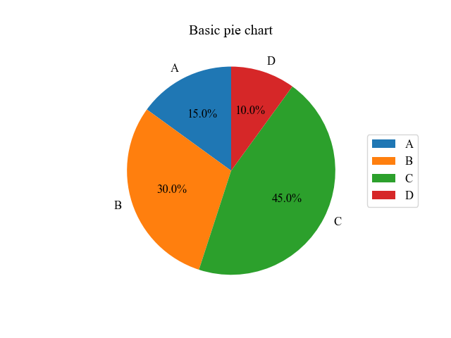
Rotation direction and position of the element (counterclock, explode, startangle)
Customize the rotation direction, diameter position, and circumferential position of pie chart elements
Rotation direction clockwise (counterclock)
The counterclock=False sets the rotation direction of the pie chart to clockwise.
# step3 Plot a pie chart
# counterclock=False
ax.pie(sizes, labels=labels, autopct='%.1f%%', startangle=90, counterclock=False)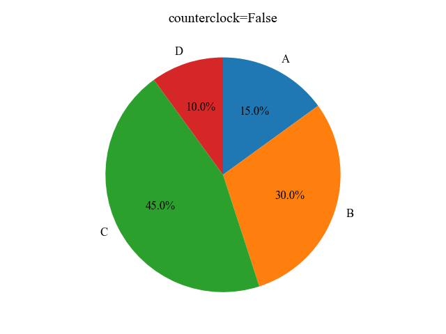
Change the position of the diameter direction to make it stand out. (explode)
explore= (array of numbers) changes the position of the elements in the diameter direction.
This is recommended for emphasis.
# step3 Plot a pie chart
explode = (0, 0.1, 0, 0)
ax.pie(sizes, labels=labels, autopct='%.1f%%', startangle=90, counterclock=False, explode=explode)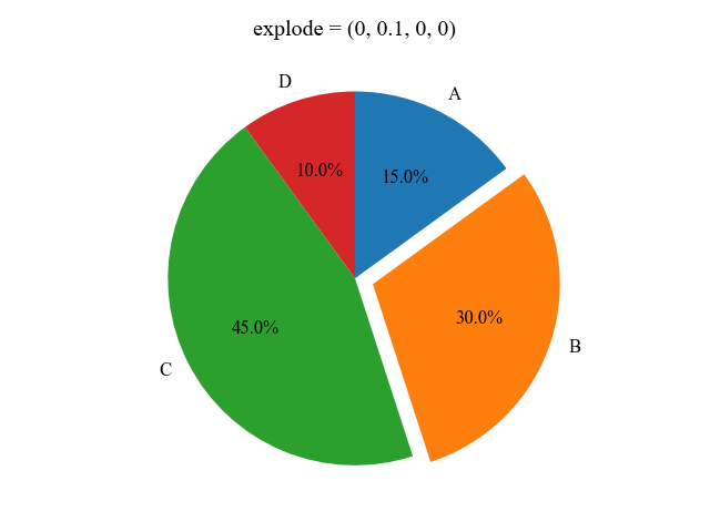
Change the circumferential position (startangle)
startangle=(angle value) changes the element’s circumferential position freely.
# step3 Plot a pie chart
# startangle=0
ax.pie(sizes, labels=labels, autopct='%.1f%%', startangle=0, counterclock=False)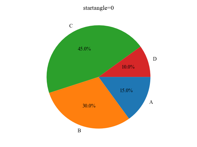
Adjust numerical labels for percentages (autopct, pctdistance, normalize)
autopct displays numeric labels.
pctdistance also changes the position of the numeric labels.
Display numeric labels with format string (autopct)
The combination of autopct and a format string can be used to display numerical values of data.
# step3 Plot a pie chart
ax.pie(sizes, labels=labels, startangle=90, autopct='%.1f')
Display the string at any desired position. (pctdistance)
Combine autopct with a string to display a string.
The combination of autopct and strings can be used to display a strings.
The position of the label can also be specified by pctdistance=number.
# step3 Plot a pie chart
ax.pie(sizes, labels=labels, startangle=90, autopct='autopct', pctdistance=0.9)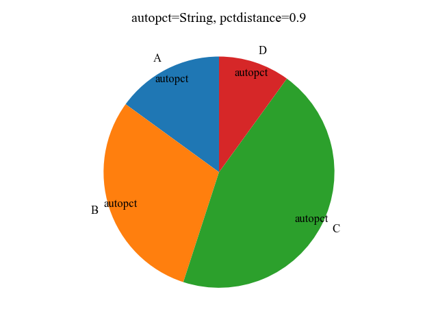
Use functions for labels to be displayed
autopct= function is also possible
This function adds 10 to the input value.
# step3 Plot a pie chart
ax.pie(sizes, labels=labels, startangle=90, autopct=add_ten)

# Function to which 10 is added
def add_ten(x):
    return round(x + 10, 1)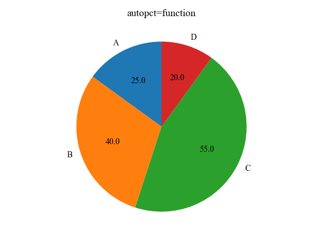
Normalize numerical labels to 100%. (normalize)
Normalizing with normalize will calculate the total to be 100%.
Display as sizes = [100, 30, 45, 10]
# Change the data
sizes = [100, 30, 45, 10]
# step3 Plot a pie chart
ax.pie(sizes, labels=labels, startangle=90, autopct='%.1f%%', normalize=True)
String labels for each group (labeldistance, rotatelabels)
Customization of labels for each group of pie charts includes labeldistance and rotatelabels, which allow you to specify the position of the labels and whether they are rotated or not, respectively.
Label Distance (labeldistance)
labeldistance=number specifies the distance of the label from the center of the pie chart.
# step3 Plot a pie chart
ax.pie(sizes, labels=labels, startangle=90, autopct='%.1f', labeldistance=1.3)
Rotate Labels (rotatelabels)
rotatelabels=True rotates the labels along the pie chart.
# step3 Plot a pie chart
ax.pie(sizes, labels=labels, startangle=90, autopct='%.1f', rotatelabels=True)
Customize colors, text, and lines (colors, wedgeprops, textprops)
For detailed customization of pie charts, use colors for element colors, wedgeprops for elements, and textprops for text.
Set a color for each element (colors)
The color of pie chart elements can be customized by specifying color.
Specify an array whose color has the same number of elements as the data array.
import matplotlib.pyplot as plt
import numpy as np

# step1 Create labels and data
labels = ['A', 'B', 'C', 'D']
sizes = [15, 30, 45, 10]
# step2 Create a graph frame
fig, ax = plt.subplots()
# step3 Plot a pie chart
# colors = [Red, Blue, Green, Yellow]
ax.pie(sizes, labels=labels, autopct='%.1f', startangle=90, colors=['r', 'b', 'g', 'y'], counterclock=False)

ax.legend(loc='center left', bbox_to_anchor=(1, 0, 0.5, 1))
plt.show()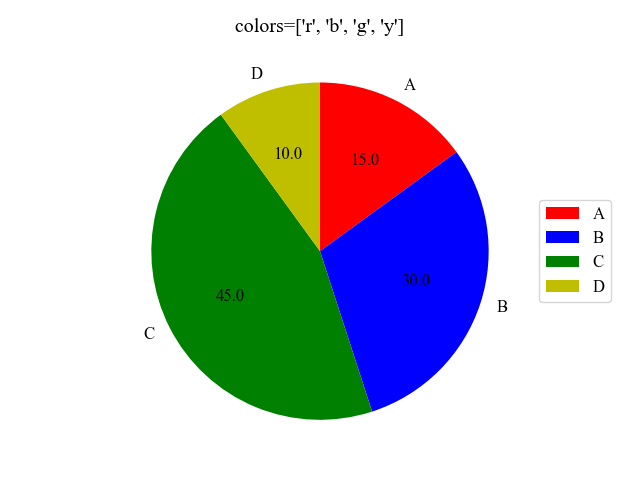
Set element colors in the colormap (Colormap)
The color map can change color according to the data values.
The function creates an RGBA array of the minimum to maximum values of the data.
- Parameters
-
- name (str) : Name of the colormap
- N (int) : Number of RGB quantization levels
- Returns
-
- Data is scalar : RGBA Array (tuple)
- Data is arrayed : RGBA Array (Data array + 4 rows)
- Official Documentation
The procedure for obtaining an RGBA color array from a colormap is shown below
- Specify colormaps with plt.colormaps
- Create an array with 0~1 numbers with the same number of elements as the data (using np.linspace)
- colors = 1 variable (array of ②)
# Using a colormap called GnBu in the range of 0.25~0.7
# Can be used in the range of 0~1
cmap = plt.colormaps['GnBu']
colors = cmap((np.linspace(0.25, 0.7, len(sizes))))

# step3 Plot a pie chart
ax.pie(sizes, labels=labels, autopct='%.1f', startangle=90, colors=colors, counterclock=False)

ax.legend(loc='center left', bbox_to_anchor=(1, 0, 0.5, 1))
plt.show()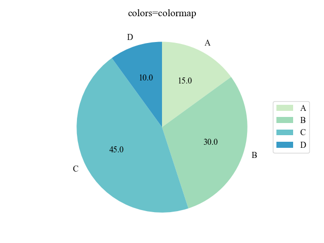
Change the colors and linewidth of the frames (wedgeprops)
The frames of the pie chart can be customized by entering a dictionary into wedgeprops.
For this graph, the frame color is red and the frame linewidth is 3.
# step3 Plot a pie chart
ax.pie(sizes, labels=labels, startangle=90, autopct='%.1f', colors=colors, counterclock=False,
        wedgeprops = {'edgecolor': 'red', 'linewidth': 3}
)

ax.legend(loc='center left', bbox_to_anchor=(1, 0, 0.5, 1))
plt.show()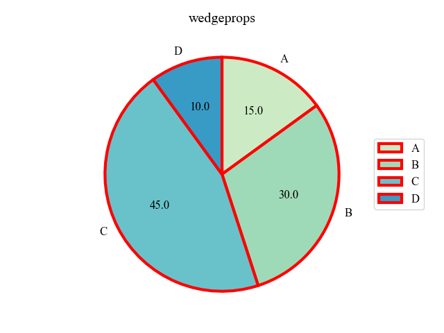
Change the size and color of text (textprops)
The text of the pie chart can be customized with textprops=dictionary.
The color is white and the size is 10 in the text of this graph.
Also, the color map was changed to Greys to make it look black and white.
# Using a colormap called Greys with a range of 0.4~0.9
cmap = plt.colormaps['Greys']
colors = cmap((np.linspace(0.4, 0.9, len(sizes))))

# step3 Plot a pie chart
ax.pie(sizes, labels=labels, startangle=90, autopct='%.1f', colors=colors, counterclock=False,
        textprops={'color': 'white', 'fontsize':20}
)

ax.legend(loc='center left', bbox_to_anchor=(1, 0, 0.5, 1))
plt.show()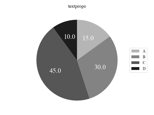
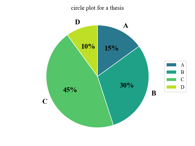
Beautiful pie charts for papers
Create a beautiful pie chart for your paper by utilizing the various arguments you have made so far.
The following tabs explain the code and flowchart
import matplotlib.pyplot as plt
import numpy as np

# step1 Create labels and data
labels = ['A', 'B', 'C', 'D']
sizes = [15, 30, 45, 10]
# step2 Create a graphframe
fig, ax = plt.subplots()
# step3 Set a colormap
cmap = plt.colormaps['viridis']
colors = cmap((np.linspace(0.2, 0.8, len(sizes))))
# step4 Plot a pie chart
ax.pie(sizes, labels=labels, autopct='%.0f%%', startangle=90, counterclock=False, normalize=True,
    colors=colors,
    wedgeprops = {'edgecolor': 'white', 'linewidth': 1.2},
    textprops={'fontsize': 17, 'fontweight': 'bold', 'family': 'Times new roman'}
)

ax.set_title('circle plot for a thesis')
ax.legend(loc='center left', bbox_to_anchor=(1, 0, 0.5, 1))

plt.show()
References
Axes.pie function
Pie charts
Labeling a pie chart
Thank you for reading this article.
Comments