A pie chart is often used to display data proportions, but for a more modern design, a doughnut graph is sometimes used by hollowing out the center of the pie chart.
This article explains how to plot donut and double donut graphs in Matplotlib
Detailed instructions are also provided on how to customize the donut graph legend, labels, percentages, changing element coordinates, colors, colormaps, thickness, text, and more.
Please refer to the following article regarding pie charts
Options for doughnut graphs
In Matplotlib, donut graphs are drawn with the Axes.pie function.
- Parameters
-
- x (1D array-like) : The wedge sizes.
- explode (array-like) : Percentage distance of each element from the center of the graph
- labels (list) : A sequence of strings providing the labels for each wedge
- colors (color) : A sequence of colors through which the pie chart will cycle. If None, will use the colors in the currently active cycle.
- autopct (None or str or callable) : autopct is a string or function used to label the wedges with their numeric value. If autopct is a format string, the label will be fmt % pct.
- pctdistance (float) : The relative distance along the radius at which the text generated by autopct is drawn.
- shadow (bool) : whether to draw a shadow beneath the pie.
- labeldistance (float) : The relative distance along the radius at which the labels are drawn.
- counterclock (bool) : Specify fractions direction, clockwise or counterclockwise.
- startangle (float)The angle by which the start of the pie is rotated, counterclockwise from the x-axis.
- radius (float) : The radius of the pie.
- wedgeprops (dict) : Dict of arguments passed to each
patches.Wedgeof the pie. - textprops (dict) : Dict of arguments to pass to the text objects.
- center ((float, float)) : The coordinates of the center of the chart.
- frame (bool) : Plot Axes frame with the chart if true.
- rotatelabels (bool) : Rotate each label to the angle of the corresponding slice if true.
- normalize (bool) : When True, always make a full pie by normalizing x so that
sum(x) == 1. - radius (float) : The radius of the pie.
- Returns
-
- patches (list) : A sequence of
matplotlib.patches.Wedgeinstances - texts (list) : A list of the label
Textinstances. - autotexts (list) : A list of
Textinstances for the numeric labels.
- patches (list) : A sequence of
- Official Documentation
Basic donut graph (wedgeprops, color)
Draws a donut graph with the center portion hollowed out from a pie chart.
The donut graph is drawn by changing the width of the pie chart using the wedgeprops argument of the Axes.pie function.
Width of the elements (wedgeprops)
The argument wedgeprops is specified as a dictionary type, {'width': 0.3}.
The following tabs explain the code and flowchart
import matplotlib.pyplot as plt
import numpy as np

# step1 Create data
width = 0.3
vals = [40, 60]

# step2 Create graph frames
fig, ax = plt.subplots()

# step3 Plot a donut chart
ax.pie(vals, startangle=90,
        # Pie Chart Width
        wedgeprops={'width':width}
)
ax.set_title('Donut chart')

plt.show()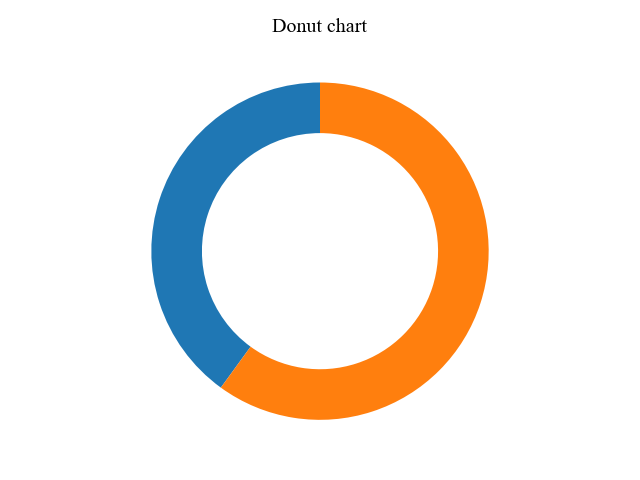
Colors of the elements (colors)
Colors of the elements are specified by colors=array.
We used a color gradient with a colormap called Blues.

The color map can change color according to the data values.
The function creates an RGBA array of the minimum to maximum values of the data.
- Parameters
-
- name (str) : Name of the colormap
- N (int) : Number of RGB quantization levels
- Returns
-
- Data is scalar : RGBA Array (tuple)
- Data is arrayed : RGBA Array (Data array + 4 rows)
- Official Documentation
import matplotlib.pyplot as plt
import numpy as np

# step1 Create data
width = 0.3
vals = [40, 60]
# step1.1 Create a colormap
cmap = plt.get_cmap('Blues')
colors = cmap(np.linspace(0.2, 0.7, len(vals)))

# step2 Create graph frames
fig, ax = plt.subplots()

# step3 Plot a donut chart
ax.pie(vals, startangle=90,
        # Donut Chart Width
        wedgeprops={'width':width},
        # Add colors
        colors=colors
)
ax.set_title('Donut chart')
plt.show()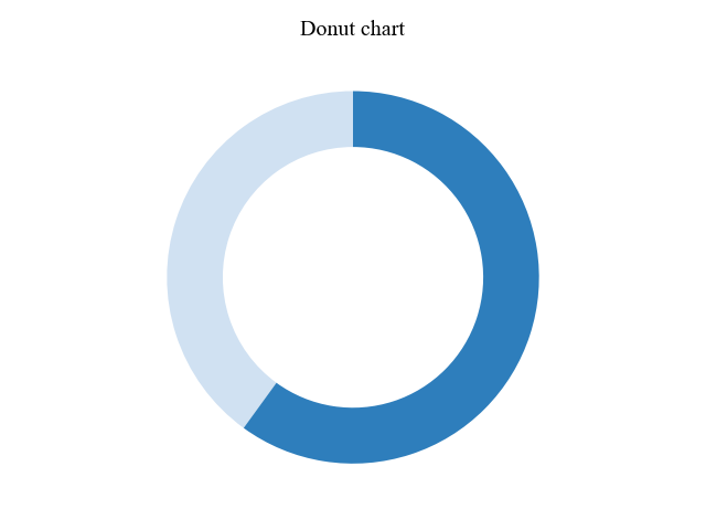
Percentage of circle center (Axes.text)
The Axes.text function displays a percentage % or strings in the center of the doughnut graph.
The following is a list of options for the Axes.text function
- Parameters
-
- x, y (float) : The position to place the text. By default, this is in data coordinates.
- s (str) : The text
- fontdict (dict) : A dictionary to override the default text properties.
- fontsize (float or size) : Font size. Numeric or size specification. {
'xx-small','x-small','small','medium','large','x-large','xx-large'} - horizontalalignment or ha (‘left’, ‘center’, ‘right’) : Horizontal adjustment
- verticalalignment or va (‘baseline’, ‘bottom’, ‘center’, ‘center_baseline’, ‘top’) : Vertical adjustment
- color or c (color) : Text Color
- Returns
- Official Documentation
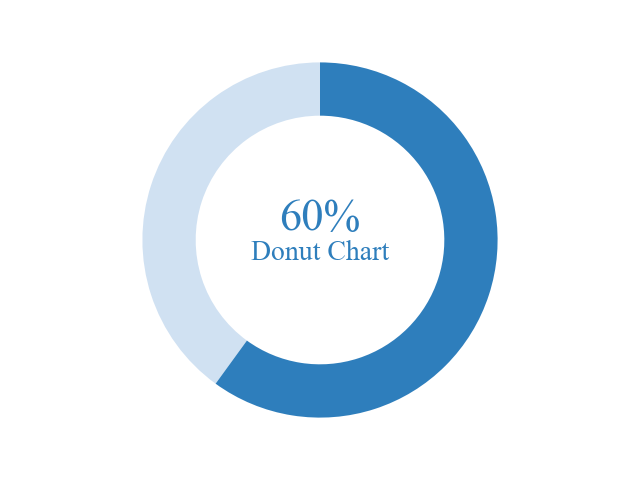
Show Percentage % (fontsize)
Specify coordinates (x, y) = (0, 0) and strings (s) = 60% + Donut Chart as arguments to Axes.text.
In addition, we set font size = 20
# step4 Add text
ax.text(0, 0, r'60%'+'\nDonut Chart', fontsize=20)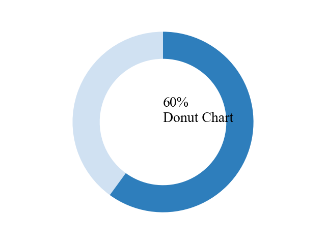
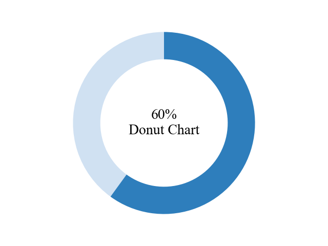
Place a percentage % (horizontalalignment, verticalalignment)
In the Show Percentage %, the position of the displayed text was not centered.
horizontalalignment='center' for horizontal, verticalalignment='center' for vertical
# step4 Add text
ax.text(0, 0, r'60%'+'\nDonut Chart', fontsize=20,
        horizontalalignment='center',
        verticalalignment='center'
)
Modern design donut graph (color)
Separate the percentage from the rest of the text and highlight only the percentage.
First, use two Axes.text functions, one for the percentage text you want to emphasize and one for the rest of the text.
Utilizing the verticalalignment of Place a Percentage, the top text is set to bottom and the bottom text to top, there is no interference at any font size.
# step1.1 Create a colormap
color_text = cmap(0.7)

# step4 Add text
ax.text(0, 0, r'60%', color=color_text, fontsize=32, fontweight='medium',
        horizontalalignment='center', verticalalignment='bottom')
ax.text(0, 0, r'Donut Chart', color=color_text, fontsize=20,
        horizontalalignment='center', verticalalignment='top')
Legend and numpy.array (Axes.legend)
This section explains how to display and arrange a legend on a donut graph.
In addition, the ndarray of numpy.array is used for graph data from this chapter.
- Parameters
-
- handles (list of Artist) : A list of Artists (lines, patches) to be added to the legend.
- labels (list of str) : A list of labels to show next to the artists.
- loc (list of str or float) : A list of labels to show next to the artists.
'best',upper left','upper right','lower left','lower right','right','center left','center right','upper center','lower center','center' - bbox_to_anchor (BboxBase) : Box that is used to position the legend in conjunction with loc.
- Returns
- Official Documentation
Legend (loc, bbox_to_anchor)
The prepared array is ndarray of numpy.array, a 2-dimensional array with 4 rows and 2 columns.
The sum of the arrays is calculated for each row, and the result is a 1D array of 4 elements, which is used for the graph.
The legend is positioned in the center left using loc='center left' and bbox_to_anchor=(1, 0, 0.5, 1) to move the legend by one graph pixel to the right in the x direction.
import matplotlib.pyplot as plt
import numpy as np

# step1 Create label and data
labels = ['A', 'B', 'C', 'D']
width = 0.3
vals = np.array([[60, 32], [40, 35], [29, 10], [18, 5]])
# step2 Create graph frames
fig, ax = plt.subplots()
# step3 Plot a donut chart
ax.pie(vals.sum(axis=1), labels=labels,
        wedgeprops={'width':width},
        startangle=90
)

ax.set_title('Donut chart with a legend')
# Legend
ax.legend(loc='center left', bbox_to_anchor=(1, 0, 0.5, 1))

plt.show()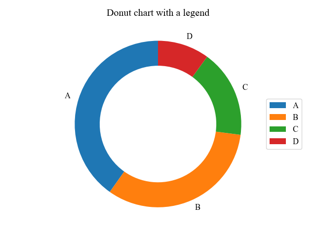
Direction of rotation (counterclock)
The rotation direction of the pie chart can be clockwise by setting counterclock=False in the Axes.pie function.
# step3 Plot a donut chart
ax.pie(vals.sum(axis=1), labels=labels,
        wedgeprops={'width':width},
        startangle=90,
        counterclock=False
)
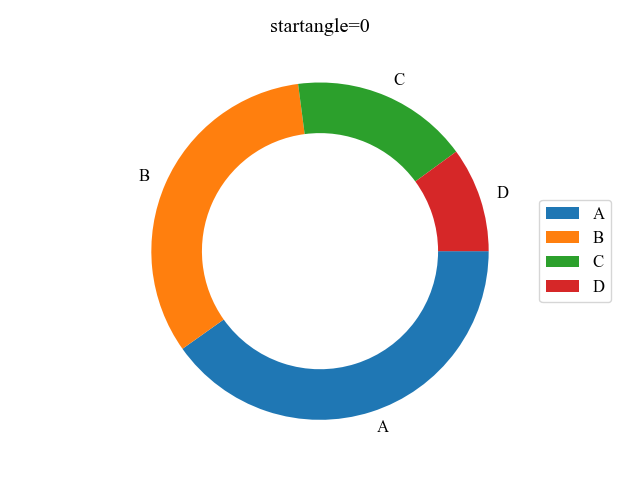
Start position of circle (startangle)
The circumferential starting position of the element is specified as an angle in startangle.
The basic starting position is at (x, y) = (1, 0)
# step3 Plot a donut chart
ax.pie(vals.sum(axis=1), labels=labels,
        wedgeprops={'width':width},
        startangle=0,
        counterclock=False
)
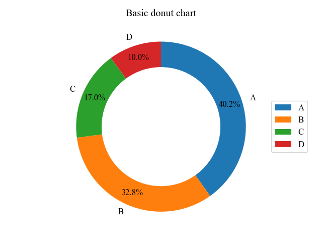
Numeric labels for each group (autopct, pctdistance)
Numeric labels can be displayed by specifying autopct as an argument to Axes.pie.
pctdistance can also change the position of the numerical labels.
# step3 Plot a donut chart
ax.pie(vals.sum(axis=1), labels=labels, startangle=90, counterclock=False,
        wedgeprops={'width':width},
        # Display of numeric labels
        autopct='%.1f%%',
        # Position of numeric labels
        pctdistance=0.85,
)
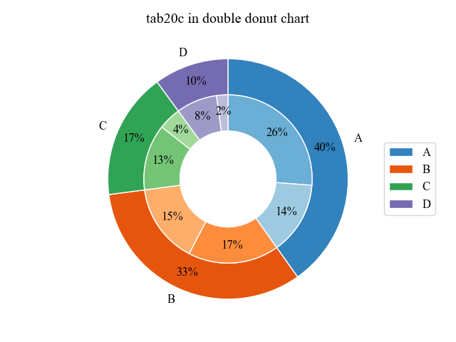
Double donut graph (radius)
When data is divided into large and medium categories, the doughnut graph is doubled so that each element can be viewed in detail.
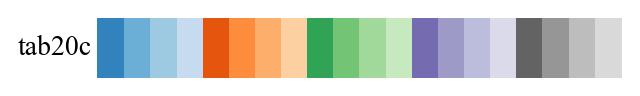
In Matplotlib, the inner donut graph is drawn by a combination of reducing the radius + separating the colors in the color map
The colormap used is tab20c, with a significant color change for each of the four.
Outer donut chart
It is drawn in the same way as the donut charts in the previous chapters.
Since there are four sets of colors per colormap, the array is passed to the colormap in multiples of four to create a color array of just the main colors.cmap(np.arange(vals.shape[0])*4)=cmap([0, 4, 8, 12])
# step1 Create labels and data
labels = ['A', 'B', 'C', 'D']
width = 0.3
vals = np.array([[60, 32], [40, 35], [29, 10], [18, 5]])
# step2 Create graph frames
fig, ax = plt.subplots()
# step3 Create a colormap
cmap = plt.colormaps['tab20c']
# Color of an outer donut chart
outer_colors = cmap(np.arange(vals.shape[0])*4)
# vals.shape[0]=nrows
# np.arange(4)=[0, 1, 2, 3]
# cmap([0, 4, 8, 12])

# step4 Plot an outer donut chart
ax.pie(vals.sum(axis=1), radius=1, startangle=90, counterclock=False,
    labels=labels,
    autopct='%.0f%%',
    pctdistance=1.15-width,
    wedgeprops={'width':width, 'edgecolor':'white'},
    colors=outer_colors)

plt.show()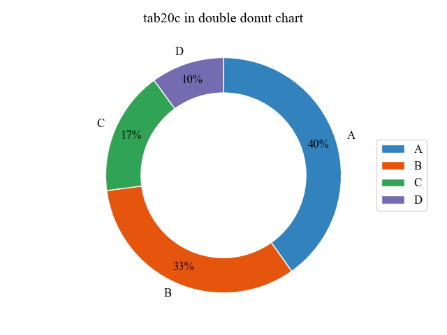
Inner donut chart (radius)
Since the main color is a multiple of 4, assign a multiple of 4 to each row and +1 to each column.cmap([1, 2, 5, 6, 9, 10, 13, 14])
Data is made into one-dimensional array by numpy.flatten
radius=1-width reduces the radius of the graph by the width of the outer graph
# step3 Create a colormap
cmap = plt.colormaps['tab20c']
# Color an inner donut chart
inner_colors = cmap([i*4+j+1 for i, vs in enumerate(vals) for j in range(vs.size)])
# i*4: Assign multiples of 4 to each row
# j+1: Add +1 per column

# step5 Plot an inner donut chart
ax.pie(vals.flatten(), radius=1-width, startangle=90, counterclock=False,
    autopct='%.0f%%',
    pctdistance=1.1-width,
    wedgeprops={'width':width, 'edgecolor':'white'},
    colors=inner_colors)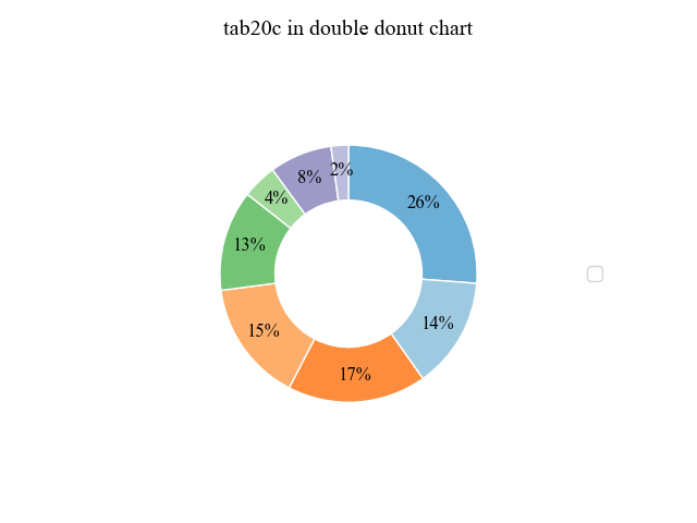
double donut graph
A double donut graph plots the outer doughnut graph and the inner doughnut graph together.
The following tabs explain the code and flowchart.
# step1 Create labels and data
labels = ['A', 'B', 'C', 'D']
width = 0.3
vals = np.array([[60, 32], [40, 35], [29, 10], [18, 5]])
# step2 Create graph frames
fig, ax = plt.subplots()
# step3 Create a colormap
cmap = plt.colormaps['tab20c']
outer_colors = cmap(np.arange(vals.shape[0])*4)
inner_colors = cmap([i*4+j+1 for i, vs in enumerate(vals) for j in range(vs.size)])

# step4 Plot an outer donut chart
ax.pie(vals.sum(axis=1), radius=1, startangle=90, counterclock=False,
    labels=labels,
    autopct='%.0f%%',
    pctdistance=1.15-width,
    wedgeprops={'width':width, 'edgecolor':'white'},
    colors=outer_colors)

# step5 Plot an inner donut chart
ax.pie(vals.flatten(), radius=1-width, startangle=90, counterclock=False,
    autopct='%.0f%%',
    pctdistance=1.1-width,
    wedgeprops={'width':width, 'edgecolor':'white'},
    colors=inner_colors)

ax.set_title('tab20c in double donut chart')
ax.legend(loc='center left', bbox_to_anchor=(1, 0, 0.5, 1))
plt.show()
References
Donut pie chart
Labeled pie charts and donut pie charts
Comments