You may want to accurately understand the distribution and characteristics of your data and visually capture the extreme regions and medians, but you may be confused about how to use violinplots and what they mean for your data.
This article explains the different types of violinplots in Matplotlib, how to customize them, and how to display the distribution, mean, median, and extreme of data in an easy-to-understand manner.
Improve your data analysis skills and grasp the essence of your data!
Please refer to the following article for a box-and-whisker diagram
Axes.violinplot function
Violin plots are drawn by specifying an array as the first argument to Axes.violinplot function.
- Parameters
-
- dataset (array) : The input data.
- positions (array) : The positions of the violins.
- vert (bool) : If true, creates a vertical violin plot.
- widths (float, array) : Either a scalar or a vector that sets the maximal width of each violin.
- showmeans (bool) : means. Default is False
- showextrema (bool) : extrema.Default is True
- showmedians (bool) : medians.Default is False
- quantiles (array) : Specified as an array with the same configuration as dataset
- points (int) : Defines the number of points to evaluate each of the gaussian kernel density estimations at.
- bw_method (str) : The method used to calculate the estimator bandwidth. This can be ‘scott’, ‘silverman’, a scalar constant or a callable.
- Returns
-
dict
A dictionary mapping each component of the violinplot
- bodies (PolyCollection) : The filled area
- cmeans (LineCollection) : Marks the mean values
- cmins (LineCollection) : Marks the bottom
- cmaxes (LineCollection) : Marks the top
- cbars (LineCollection) : Marks the centers
- cmedians (LineCollection) : Marks the median values
- cquantiles (LineCollection) : Identify the quantile values
- Official Documentation
Basic Violin Plots (dataset)
A 1D array will produce one violin plot
A 2-dimensional array contains as many violin plots as there are elements
The following tabs explain the code and flowchart
import matplotlib.pyplot as plt
import numpy as np

# step1 Fix the random numbers generated
np.random.seed(19680801)
# step2 Create data
all_data = [np.random.normal(0, std, 100) for std in range(7, 10)]
labels = ['x1', 'x2', 'x3']
# step3 Create graph frames
fig, ax = plt.subplots()
# step4 Plot violin plots
ax.violinplot(all_data)

ax.set_xticks(np.arange(1, len(labels) + 1), labels=labels)
ax.set_xlabel('X label')
ax.set_ylabel('Y label')
ax.set_title('Basic Violin')

plt.show()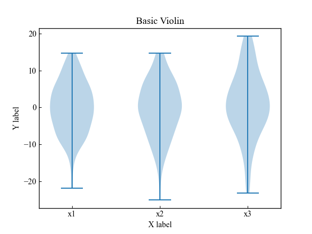
Place horizontally (vert)
Basically, the violin diagram is vertical, but it can be displayed horizontally with vert=True.
# step4 Plot violin plots
ax.violinplot(all_data, vert=False)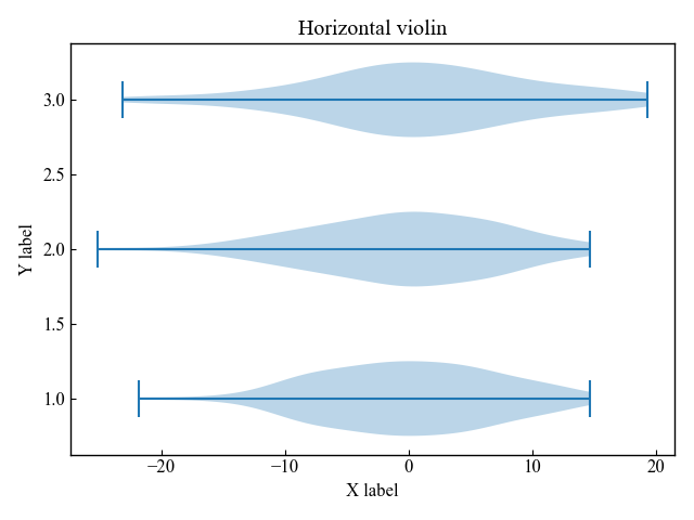
Adjust maximum width (widths)
The maximum width of the data distribution is set by widths, which can be specified as a scalar or an array.
widths = scalar
If specified as a scalar, all violin plots are drawn with the same maximum width.
Default is widths=0.5
# step4 Plot violin plots
ax.violinplot(all_data, widths=0.5)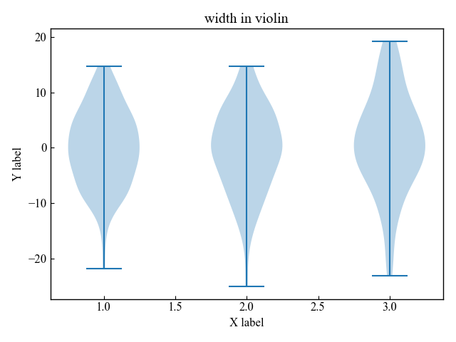
widths = array
The array should have the same number of elements as the number of violin plots.
The maximum value of each violin diagram corresponding to an array can be changed.
# step4 Plot violin plots
ax.violinplot(all_data, widths=[0.2, 0.5, 1])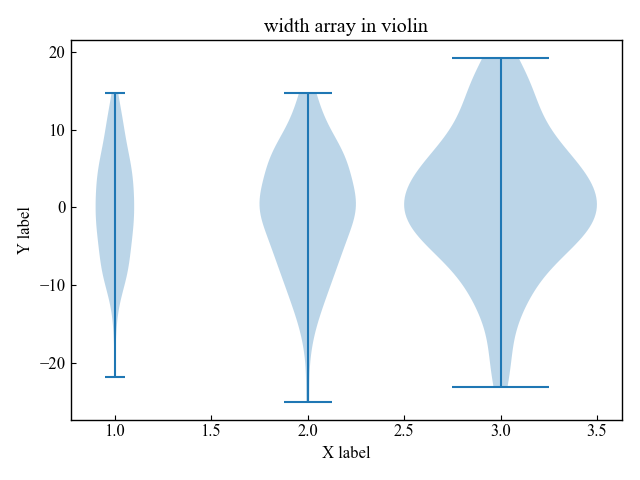
Displays mean, extrema, and median
For violin and box plots, it is important to display the mean, extrema, and median.
First, let’s draw a violin diagram with everything hidden
# step4 Plot violin plots
ax.violinplot(all_data, showmeans=False, showextrema=False, showmedians=False)
Mean value (showmeans)
Define the violinplot function argument showmeans to be True.
In the graph below, set_color was used to change the line color.
# step4 Plot violin plots
showmeans = ax.violinplot(all_data, showmeans=True, showextrema=False, showmedians=False)
showmeans['cmeans'].set_color('C1')
Extrema (showextrema)
Define the violinplot function argument showextrema to be True.
In the graph below, set_color is used to change the line color of the lower and upper extrema.
# step4 Plot violin plots
showextrem = ax.violinplot(all_data, showmeans=False, showextrema=True, showmedians=False)
showextrem['cmins'].set_color('C2')
showextrem['cmaxes'].set_color('C3')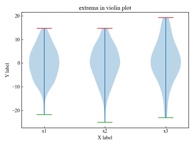
Median value (showmedians)
Define the violinplot function argument showmedians to be True.
In the graph below, set_color was used to change the line color.
# step4 Plot violin plots
showmedians = ax.violinplot(all_data, showmeans=False, showextrema=False, showmedians=True)
showmedians['cmedians'].set_color('C1')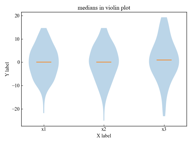
Set Colors (bodies)
The violin plot sets the color using the returned dict key, bodies.
Various settings are available, but the most commonly used color settings are described below.
Color of data distribution area (set_color, set_facecolor)
Customize the color of the data distribution area
Use set_color for bodies as the return key
# step4 Plot violin plots
vio = ax.violinplot(all_data)

# Use bodies as the return key
for body in vio['bodies']:
    body.set_color('C1')

plt.show()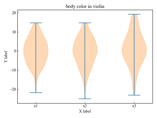
The same can be done with set_facecolor for bodies in the return key
# Use bodies as the return key
for body in vio['bodies']:
    body.set_facecolor('C2')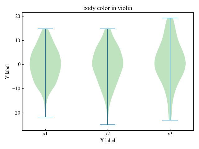
Color and width of the data distribution frame (set_edgecolor, set_linewidth)
Customize the color of the frame of the data distribution
Use set_edgecolor for bodies as return key
The line width of the border can be adjusted for better clarity by using set_linewidth at the same time.
# step4 Plot violin plots
vio = ax.violinplot(all_data)

# Use bodies as the return key
for body in vio['bodies']:
    body.set_edgecolor('red')
    body.set_linewidth(3)

plt.show()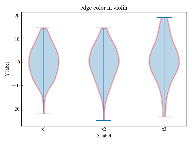
Comparison of Violin and Box plot
The violin plot is especially useful when there are multiple peaks in the data distribution. The mean (or median) and interquartile range are plotted inside the violin plot.
Violin plot
Includes all distribution data, not just summary statistics
# step4 Plot violin plots
vio = ax.violinplot(all_data, showmeans=True, showmedians=False)
vio['cmeans'].set_color('C1')

ax.set_xticks(np.arange(1, len(labels) + 1), labels=labels)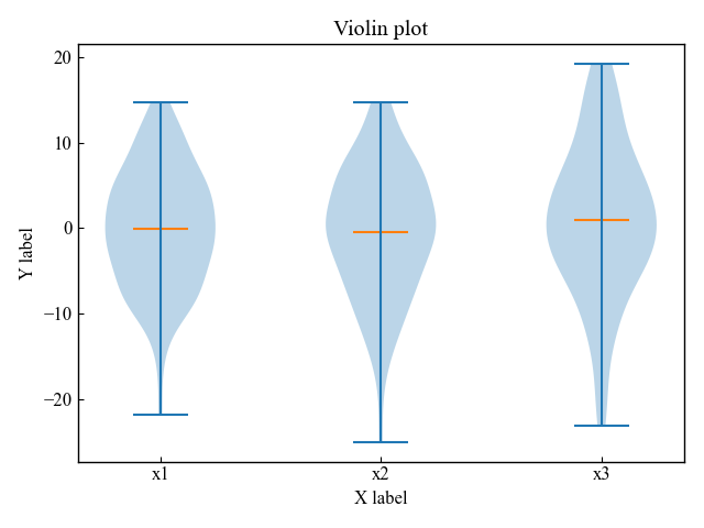
Box-and-Whisker plot
Only the summary statistics, mean/median and interquartile range, are included.
# step4 Plot Box-and-Whisker plots
ax.boxplot(all_data)

ax.set_xticks(np.arange(1, len(labels) + 1), labels=labels)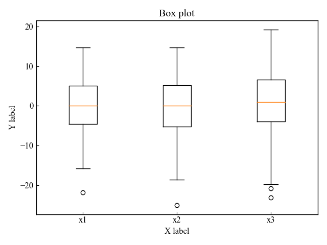
References
Axes.violinplot function
Basics of Violin plot
Customize a violin plot
Box-and-whisker plot vs. violin plot
Comments