Stacked area graphs are an extension of the basic area graph
The values of each group are displayed on top of each other, so you can see the sum of the values and their change on the same graph.
This article explains how to plot a stacked area chart in Python’s Matplotlib.
This article also explains how to plot ThemeRiver and stream graphs.
For basic area graphs, please refer to the following article
Basic stacked area charts (Axes.stackplot)
Stacked area chart is drawn using the stackplot function
- Parameters
-
- x (array) : 1D array data
- y (array) : 1D array data. Rows are the number of groups, columns are the number of elements equal to x
- labels (list of str) : A sequence of labels to assign to each data series.
- baseline (array) : Method used to calculate the baseline,‘zero’, ‘sym’, ‘wiggle’, ‘weighted_wiggle’
- colors (list of color) : A sequence of colors to be cycled through and used to color the stacked areas.
- Returns
-
- list of PolyCollection
- Official Documentation
The following tabs explain the code and flowchart
import matplotlib.pyplot as plt
import numpy as np

# step1 Create dara
x = np.linspace(0, 10, 100)
dict_y = {
    'y1': x**1.5,
    'y2': x**2,
    'y3': x**2.1,
    'y4': np.exp(0.4*x),
    'y5': np.exp(0.4*x)+np.sin(x),
}
# step2 Create graph frames
fig, ax = plt.subplots()
# step3 Plot a stacked area chart
ax.stackplot(x, dict_y.values(), labels=dict_y.keys())

ax.set_xlabel('X label')
ax.set_ylabel('Y label')
ax.legend(loc='upper left')
ax.set_title('Simple Stackplot')

plt.show()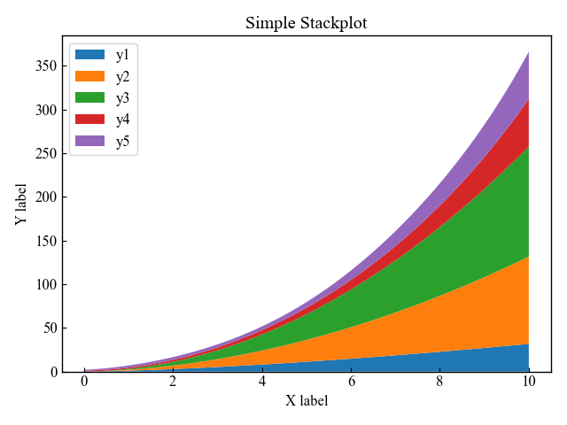
Symmetrical ThemeRiver centered on zero (sym)
If the stackplot function’s argument is baseline=sym, you can draw a stacked surface graph symmetric about zero.
It is a visualization method called ThemeRiver, a metaphor for a river
# step3 plot a stacked area chart
ax.stackplot(x, dict_y.values(), labels=dict_y.keys(), baseline='sym')
ax.axhline(0, color='black', ls='--')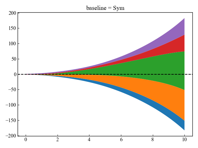
Stream graph with minimal layer oscillation (wiggle)
If the argument to the stackplot function is baseline=wiggle, a stream graph is plotted
The stream graph is arranged to minimize layer “wobble” around the central axis
It is said to be easier to read than basic stacked surface graphs or ThemeRiver in value comparison work
# step3 Plot a area chart
ax.stackplot(x, dict_y.values(), labels=dict_y.keys(), baseline='wiggle')
ax.axhline(0, color='black', ls='--')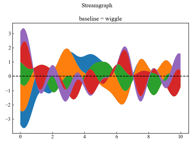
Colors of each group (colors)
The colors can be set for each group by defining colors as an argument to the stackplot function
In this article, the number of data is 5 elements, so I defined a list with 5 color names entered
Please refer to the following for possible color settings in Matplotlib
# step3 Plot a area chart
colors = ['forestgreen', 'limegreen', 'aquamarine', 'cyan', 'skyblue']
ax.stackplot(x, dict_y.values(), labels=dict_y.keys(), colors=colors)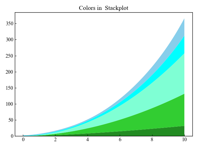
References
Area-filled surface graph
Stacked area charts and stream graphs
stackplot function
Comments